Tuesday, November 03, 2015

Odd Mathematical Patents #1: Gömböc

The Gömböc is a self righting shape. A bit like a turtle that will always rotate back to standing up if placed on its back. This shape was patented under US D614077 S1 and a cease and destist has been send to someone giving plans to 3D print one.
Prof. Domokos has politely requested that I remove this file. I have respectfully declined to do so, as I do not believe it violates any of their established legal rights, and I believe it may have actual value for researchers interested in the Gömböc and mono-monostatic bodies in general.

Gömböc's are cool. And the inventors were very ingenious. You can buy one from the patent holders here. Patenting a shape though strikes me as weird.

Monday, October 12, 2015

Stacked Area Chart In Javascript

A stacked area chart of transatlantic slave trace made with c3.js and the transatlantic slave trade database

The graph shows the counts for each region the slaves were disembarked by year. The html and javascript for this graph is on a gist here

The data used can be gotten from the slavevoyages.org website with the filters beloew

An actual graph you can play with is here and in the result tab below

Saturday, October 10, 2015

Danny Boyle films

Danny Boyle films revolve around a group of friends who find X. And how X affects their relationship.

Where for each film X is

Shallow Grave Bag of Money
Trainspotting Bag of heroin
The Beach A map
Millions Bag of money
Sunshine A spaceship
28 Days Later... An outpost
Slumdog Millionaire A gameshow

I can't haven't seen so do not know what X is in A Life Less Ordinary, 127 Hours, Steve Jobs or Trance

Friday, October 09, 2015

The Man in the White Suit

The man in the white suit is about a scientist who invents clothes that never wear out and never need washing. It is from 1951 and deals Alec Guinness finds himself hated by all. Both the capital owning class who realise they will have no clothes to sell anymore. And the poor labourers who won't have work making cloth, clothes or washing them.

All these 1950s cloth making jobs have left Britain in the decades since. Hans Rosling pointed out that the washing machine in common use since then is one of the best invention ever for freeing us from drudgery.

Worry about how computers will get rid of all the jobs are common now. Race against the machine is one good book on the topic. But the washer women in The Man in the White Suit are not in Britain anymore. Though much of the clothes making has just moved country without making the people doing it much richer.

We now in Europe live the terrifying world imagined in the Man in the White Suit. Where you can clothe yourself in pennies for very little. Wash your clothes for little effort of money. And it is not that bad. Technological progress is not bad. As Stephen Hawking points out it is not the technology but who the benefits go to

If machines produce everything we need, the outcome will depend on how things are distributed. Everyone can enjoy a life of luxurious leisure if the machine-produced wealth is shared, or most people can end up miserably poor if the machine-owners successfully lobby against wealth redistribution. So far, the trend seems to be toward the second option, with technology driving ever-increasing inequality.

Tuesday, October 06, 2015

Golf Courses Versus Book Shops

"Between 1990 and 2010, the number of 18-hole golf courses in Ireland exploded from 213 to 352."

Searching Golden Pages gives

300 results for Booksellers

397 results for Golf Course

It looks to me that there are more golf courses than book shops in Ireland.

Friday, October 02, 2015

Pouring one out for your Ancient Greek Homies

Hecuba mother of Hector and Paris in the Iliad pours one out for her homies

Stay, till I bring the cup with Bacchus crown'd,

In Jove's high name, to sprinkle on the ground,

And pay due vows to all the gods around

Pouring some of your alcoholic beverage on the ground is an ancient and common across many cultures. It is a practice called Libation.

The other word for today is Adoxography "fine writing on a trivial or base subject". The best adoxography books ive read recently are Red: The history of red hair, Paper an elegy and The Phone Book.

Thursday, September 24, 2015

Penrose's Law

Penrose's Law[3][4] states that the population size of prisons and psychiatric hospitals are inversely related, although this is generally viewed as something of an oversimplification
That was thought up by from Lionel Penrose in 1939 (he was Roger Penrose's father). And it still seems broadly accurate
During 1960–2004, there was a 74% population-adjusted decrease in mental institution beds and a 52% increase in the prison population. The same period saw a 500% increase in overall crime and a 900% increase in violent crimes, with a concurrent 94% increase in the size of the country's police force. Penrose's law proved remarkably robust in the longitudinal perspective

Sunday, September 20, 2015

Irish Suicide Statistics

There is an interesting article in 20th Sept issue of Irish Daily Mail on Sunday by Alison O'Reilly on the emotional difficulties priests in Ireland have.

The figures given claim priests are at a much greater risk of suicide than the general public

However if looking at who priests are I do not think this is the case. According to the CSO here

"The age-standardised death rate from suicide was 12.1 deaths per 100,000 in 2011" not the 5.12 figure in the article.

Also Males are at a higher risk anyway. "male suicide rates were five times higher at 20.5 deaths per 100,000"

And Older males at a higher risk still. "male suicide rates were highest in the 45-64 age-group (28 per 100,000)". The average age of an Irish priest is around 65.

Just by their gender and age profile priests 35ish to the general population 28 per 100,000 do not seem that different.

Finally priests are unmarried which is a well known correlate of suicide. To take one paper Suicide and marital status in Northern Ireland "Never marrying increased male suicide risk and its effect increased with age IRR among over 55 year-olds = 2.33". 2.33 * 20.5 base =47 per 100k

I had not realised quite how bad it was for those bachelor farmers in terms of suicide. This (greater than 28) rate compares with 1.2 for murder in Ireland.

The story here is not how bad suicide is for priests but how bad the problem is for all single older men in Ireland.

Sunday, September 13, 2015

Japan Loves Faxes

In Japan, faxes are still used extensively for cultural and graphemic reasons and are available for sending to both domestic and international recipients from over 81% of all convenience stores nationwide.

Coupland explains that he thinks the Japanese addressing system is the cause of its love of faxes.

Graphemic reasons are that typing was never really popular in Japan. Partly because of the three alphabets and partly just because of an appreciation of calligraphy.

Another reason is the use of forms that do not really fit electronic formats

But I love the explanation that the Japanese addressing system has lead to an 80s technology getting popular and it staying alive

Monday, June 15, 2015

When did we get too much stuff?

Kevin Kelly pointed out that we have more types of things (species of technology) than even the most wealthy had in the past. "count the number of species of technology in our household. And it came up with 6,000 different species of products. I did some research and found out that the King of England, Henry VIII, had only about 7,000 items in his household. And he was the King of England, and that was the entire wealth of England at the time." Kevin Kelly

How much more stuff can we get over time? The Argos catalog seems to get bigger each year and it seemed to me an ideal way to measure the amount of stuff we get to decide we don't want.

Retromash is a great site for old Argos catalogs. I Counted the total page numbers in each years catalog. I don't have the slaves undergraduates needed to count everything in the actual catalog. Retromash don't have much after 1990 so I went to ebay and they list the number of pages. This produces this data (with links to the ebay sources). One weirdness is there seemed to have been an instore catalog and superstore (to be delivered) catalog for a few years.

I have tried to give the number of pages of the Autumn/Winter Argos catalog you get in the shop in any given year.

The graph is just a simple ggplot2 scatterplot

mydata = read.table("argos.tsv", header=TRUE)

ggplot(mydata, aes(x=Year, y=pages)) + geom_point(shape=1) + geom_smooth(method=lm, se=FALSE)

ggsave(file="argos.png")

It looks like there are nine times the number of things we can choose now from Argos as there was in 1975. To put a prediction on this, the amount of things you can buy nearby doubles ever decade.

Tuesday, May 26, 2015

Sports in decline

I read this interesting article in the diminishing interest in surfing. Can Anyone Save the Surf Industry?. The author uses

All the outdoor individual sports seem to have declining interest as measured by google trends. This could be to do with how people search google. But it does look like they are getting less popular.

The good news is Golf also seems to be in the decline

Tuesday, May 19, 2015

Uhaul Map of the US

You rent a Uhaul truck in New York to move to a new job in Texas. UHaul will be left with a truck in Texas. If people really want to go New York -> Texas but less so Texas-> New York they will reduce the price of the Texas -> New York. If you get all the prices to move one way between all the cities in the US you end up with a good idea of where people are moving. And as people usually move for jobs where the jobs are.

The idea I saw first in Marginal Revolution. This blogpost seems to be where the whole UHaul weighted graph idea came from. Dan Armstrong and Páll Hilmarsson
I took a list of the 34 most populous US cities (all over 500,000) from wikipedia. This is 1122 links in total. The 294 cities is 86142 total links. You only seem to be able to get containers not trucks from Honolulu, Hawaii.
This is a Complete graph where each edge has a length and a weight/capacity (price). some cities are really cheap to leave because enough people are moving (sinking) there that UHaul want to get the trucks back to the cities people are leaving (source) The extreme costing trips are

Source Destination Price
San Jose, CA Washington, DC 4237
San Francisco, CA Baltimore, MD 4188
San Jose, CA Baltimore, MD 4181
San Jose, CA Washington, DC 4132
Baltimore, MD Washington, DC 74
Washington, DC Baltimore, MD 79
You can get the spreadsheet with all 1122 trips here

The trips with the biggest difference between one way and another are by price

Source Destination Round dif Round ratio
San Jose, CA Washington, DC 2404 2.3
San Francisco, CA Washington, DC 2345 2.3
Philadelphia, PA Portland, OR 2213 3

and by ratio

San Francisco, CA Las Vegas, NV 608 4.1
Source Destination Round dif Round ratio
San Jose, CA Las Vegas, NV 580 4.1
San Francisco, CA Las Vegas, NV 608 4.1
Philadelphia, PA Jacksonville, FL 1301 3.9

The spreadsheet with these calculation is here. the code to work all this out is pretty raw but it is here.
I will come back to this later and work out Eigenvalue Centrality and maybe how distance relates to prices. Also it would be interesting to see if some places are summer sinks and some winter sinks in a few months time.

Sunday, April 19, 2015

England's Temperature in 2014

2014 was UK's hottest year on record, says Met Office. What does that mean on a day to day basis? England has a collected data on daily temperature from 1772 in the Hadley Centre Central England Temperature (HadCET) dataset.

According to wikipedia, last year was the hottest year in this dataset with an average temperature of 10.94 °C.

I downloaded this Hadley Centre dataset. And I followed this tutorial. Based on an original graphic by Tufte. The picture is similar to the one from my post on Dublin's 2014 Weather.


Looking at the black line that represents last years temperatures it was the winter and autumn that were far above average. Instead of a scorching hot summer the three record hot days were in October and December. No day in 2014 was the coldest for that date in the recorded time.

The wikipedia page on this dataset shows the average temperature of this dataset rising over time

Saturday, April 18, 2015

Peak Loom Band

I was talking to the owner of a craft shop today. She told me she knew of many people who were stuck with stock from the loom band craze of last year. Waterford Whispers reported it as "Parents Urged To Hack Off Any Child’s Arm That Comes In Contact With Loom Bands".


A Google Trends shows the craze's lifespan


By the end of summer all that was left was a bin of tiny plastic hoops at bargain prices. Are crazes lasting less time now?


The Age Of Earthquakes points out


Crazes end. This is not like the Tulip or the South Seas Bubble. I don't remember hearing people would get rich selling loom band to each other. Unlike the way Beanie babies were sold as an investment. The sort of thing you could split up during a divorce


BTW she thinks Parachute Cord will be the next craze

Sunday, April 12, 2015

Photographing your food and everything else

Who was the first person to photograph all their meals? It seems a reasonably common thing now "26 out of 45 customers spend an average of 3 minutes taking photos of the food."
First Camera, Then Fork discussed the taking photos of your food phenomena but doesn't describe who initiated it.
But who was the first person to start photographing all their meals? Or indeed all their activities. Obviously its much cheaper for us to do now with smartphones but was there an eccentric Victorian lord who photographed everything? Life loggers have been around since the 1990s. I'd be surprised if none of them deliberately photographed their food at the time.
“Tell me what you eat, and I will tell you what you are.” Jean Anthelme Brillat-Savarin in 1825.

If food photos are much more popular how about all photos? How many photos are taken a day and how does that compare with in the past?

Facebook Photo uploads total 300 million per day
Instagram averages 70 million photos a day
Flickr 1 million photo shares a day
Photobucket says "More than 2.25 million images are shared daily"
There is a buzzfeed page on photo stats How Many Photos Have Been Taken Ever?
It’s estimated only a few million pictures were taken in the 80 years before the first commercial camera was introduced.
"By 1930, about a billion photos were taken a year." So in three days more photos are being uploaded onto facebook/instagram than then taken in the world in the 1930s.
"By 1970, about 10 billion photos were taken a year." Or a month of photos being put up onto facebook/instagram.
This article "This is What the History of Camera Sales Looks Like with Smartphones Included" has a great graph that explains why this huge increase in photo taking.


Friday, April 03, 2015

Smoky cooking is worse than war

Over 4 million people die prematurely from illness attributable to the household air pollution from cooking with solid fuels.
that is according the WHO.

Compare that to other things we worry more about
Road traffic injuries 1,274845
Suicide 844 460
War 70,000
Murder 430,000

'the number of war deaths has also plummeted. In the 1950s, there were almost 250 deaths caused by war per million people. Now, there are less than 10 per million' With 7 billion people in the world that would be 70,000 per year. '437,000 people murdered worldwide in 2012'
The war statistic is a bit misleading as things go be very quiet until a big one kicks off.

Still the idea that instead of sitting around camp fires singing peace protest songs we should sing campfire protest songs was surprising to me.

Thursday, April 02, 2015

Farage's Claims about HIV in the UK

Labout leader Ed Miliband called out UKIP leader Nigel Farage here on a hiv claim


The claim is reported here as
Nigel Farage has lashed out at NHS treatment for foreign HIV patients – branding them “health tourists”. The UK Independence Party leader made the claims in ITV’s leadership debate this evening. He said: “Here’s a fact, and I’m sure other people will be mortified that I dare to talk about it. “There are 7000 diagnoses in this country every year for people who are HIV positive, but 60 percent of them are not for British nationals.

To break this down "In 2012, there were 6,360 new diagnoses of HIV". "There were 6,000 people (4,480 men and 1,520 women) newly diagnosed with HIV in the UK in 2013". The 7000 figure sounds high. Lets see what data is produced to back this up.

"60 percent of them are not for British nationals."
Thanks to Roma in the comments who pointed out 'new diagnoses reported among people born in the UK ... to 46% (2,220/4,980))' from the 2014 report. This is not a nationality figure. But it is pretty close to one. Some born in the UK won't be British Nationals and a fair few born abroad will be. A graph from here shows


Implying from ethnicity to nationality does not really work I think. But it does make the 60% claim look like it needs more evidence. The figure for Asians and Black Caribbean's is about 500 or under 10%.
Another vaguely nationality source of data I can find is from HIV in the United Kingdom: 2013 Report Appendix 1 total men+women African born 11,100+20,700 out of 98,400 which is about a third of HIV carries in the UK seem to be African born heterosexuals. Again with the assumption that all African born people are not British nationals.

To me these claims, of 7000 new cases and 60% of them not British Nationals, look dubious but I am open to evidence correcting me.

Monday, March 23, 2015

Areas of Ireland that have only ever had white male TDs

There is a great map on the mirror website in the article 'The UK map of white male power' of constituencies in the UK that have only ever had white male MPs

I thought it would be interesting to see what the same map would look for Ireland. The wikipedia page for Irish Women TD's is here, from it I took the list of constituencies that have been represented by Female TDs.

Ireland has not had many non white TDs. Moosajee Bhamjee is the first non white TD as far as I know. Leo Varadkar's father is Indian. And I am probably missing many more but historical demographics suggest non white Irish politicians were rare. We had a low immigrant population until recently. To keep the graph comparable to the UK one I keep the same not 'white male' filter. Please correct me with anyone I am missing.

Taking distinct constituencies from the Female TD's wikipedia page. And a map of Irish constituencies now from here. I coloured in the constituencies I could find female TDs for in green.


For some old constituencies, like Cork Mid, I could not work out where they were. One ex-constituency Limerick City–Lmk East had a female deputy, Kathleen O'Callaghan in 1921. I took the map of where this constituency used to cover when she represented it and turned that area in the east part of Limerick-West green.
Map of Limerick City–Lmk East in 1921

Another Dublin North has completely changed its location. When Margaret Collins-O'Driscoll represented it in 1923 it covered what is now Dublin North-East. So this area is also coloured green.


The constituencies I could not find a female TD for were: Cork South-West, Limerick West and Louth. The constituencies wikipedia listed as having had a female TD are Carlow–Kilkenny, Cavan–Monaghan, Clare, Clare–Galway South,  Cork East, Cork Mid, Cork North–Central, Cork North–East, Cork North–West, Cork South–Central, Donegal North–East,   Donegal South–West,   Dublin Ballyfermot, Dublin Central, Dublin County Mid, Dublin Mid, Dublin North, Dublin North–Central,   Dublin North–West,   Dublin South, Dublin South–Central,   Dublin South–East,   Dublin South–West, Dublin St Patrick's, Dublin West, Dún Laoghaire, Galway West,   Kildare North,   Laois–Offaly,   Limerick City–Limerick East,   Limerick East, Longford–Westmeath,   Meath East,   Monaghan, Roscommon, Roscommon–Leitrim,   Sligo–Leitrim,   Tipperary North,   Tipperary South, Waterford,   Waterford County,   Westmeath,   Wexford, Wicklow .

This map looks more diverse than the UK one to me. But the proportional representation system Ireland has means we have larger constituencies with a few Members of Parliament in each. This means the same proportion of non white male Members of Parliament should cover a bigger area.
I will update this map with any corrections people give me in the comments.

Wednesday, March 04, 2015

Pandemics and the Internet

My last point pointed out how many people died in the flu pandemic in Ireland in 1918.

To take the example of Japan according to Gapminder 1918 had a huge drop. The other big drop is the is the second world war with all the bomb dropping and shooting that involved.

David Eagleman has an interesting point here about how the internet can help prevent and reduce epidemics.

"The internet can be our key to survival because the ability to work telepresently can inhibit microbial transmission by reducing human-to-human contact. In the face of an otherwise devastating epidemic, businesses can keep supply chains running with the maximum number of employees working from home. This can reduce host density below the tipping point required for an epidemic. If we are well prepared when an epidemic arrives, we can fluidly shift into a self-quarantined society in which microbes fail due to host scarcity."

Eagleman has a good short video on his thesis

The long term effects of a sudden switch to everyone avoiding each other for a month or two could be huge. These would include

Education: How schools help spread influenza has been studied. 'School closures during the 2009 influenza pandemic: national and local experiences'. If all the schools were closed for a few months and people would move to Khan Academy and other online education sites. After this period a switch back to a fully non online world won't happen

Telecommuting: In a similar way online telecommuting would become much more popular. After a quarantine lite period the use of online project management and other telecommuting tools would become mainstream.

Shopping: If you don't meet people in school or at work you meet them in the shops. Deliveries of shopping would be strongly encouraged in the event of a pandemic. They should probably even be sponsored. Shops would not get as popular again once everyone got used to online shopping.

Banking: No one likes queuing in the banks at the best of times. Even ATMs would become horrible grubby in a pandemic world. Everything including social welfare payments would try and avoid using the fomite that is cash.

Telemedecine: People with the influenza need to be kept away from people who are sick. People with other illnesses will have to be dealt with remotely to avoid them coming into contact with people with influenza.

Public Events: Public events parades, cinemas, bars and museums would be closed. By their nature these involve people. If public events are made cheaper to attend virtually that will reduce the need for people to meet up. By this I mean if Sky Sports is made free for a few months people will be less annoyed no fans are allowed attend the football game.

There are many people without access to the internet that would not be helped by the use of digital technologies. Hopefully the use of digital technologies will help focus more of the traditional public health effort on them.

When the next pandemic happens the internet will reduce the consequences. Many industries will also change but the main thing is to avoid the 50 to 100 million the last pandemic killed.

Tuesday, March 03, 2015

Tree Rings and Life Expectancy

Andy Kirk here has an interesting blog post on dendrochronology and visualisation literacy.
Here is an example of a tree ring visualisation showing how over time the tree grows and leaves down rings.


I am going to visualise another time series expected lifespan.
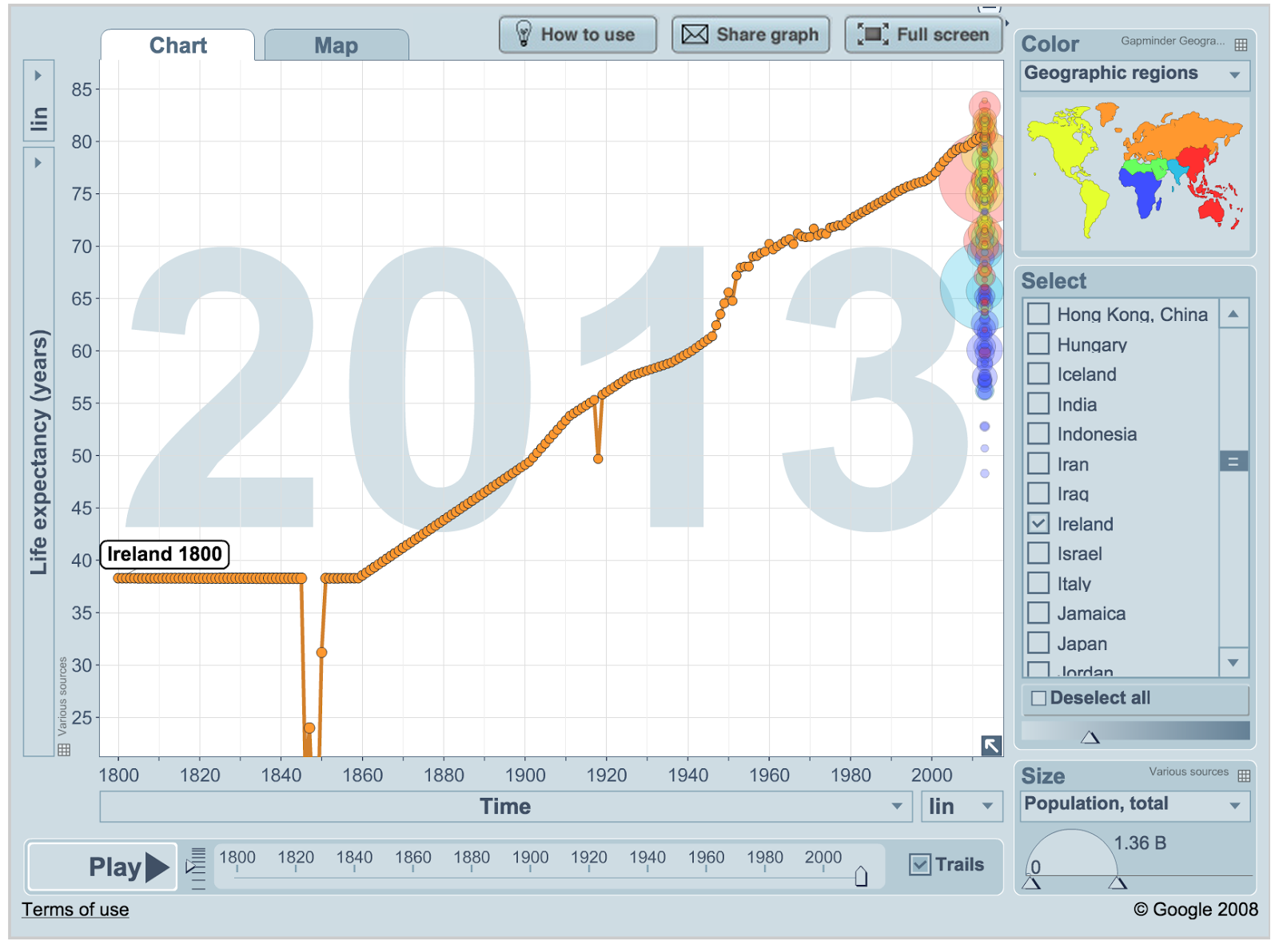
Gapminder uses a line graph to visualise life expectancy over time. I downloaded the life expectancy data from gapminder.


The interesting points here are the famine where the life expectancy dropped from an estimated 38.3 to 14.1. Also the 1918 flu epidemic causes an obvious drop from 55.3 in 1917 to 49.68 and back to 55.8 in 1919.
I use this data to create a graph using the code below. The idea is like tree rings except that instead of each line laid down in a particular year each line represents the life expectancy in that year.


The size of each ring should be a good representation on the number of years people could expect to live in that year. However I just multiplied the years given by Gapminder *6 to give the number of pixels each circles radius should be. A proper visualisation has to be more careful not to distort the number than this. Roughly, living twice as long should look like a tree that is twice as big.

The code to create this graph in a canvas element of a webpage if here. So what do you think, does this visualisation show increase in lifespan in the last 200 years well?