Star Trek in particularly the first two series was monster of the week sort of stuff. The best episodes tend not to follow the beam down get in trouble get out of it template. But I think the best follow the 'living someone else's life' Quantum Leap template
Looking at the top 20 rated episodes from imdb https://www.imdb.com/list/ls076657706/
20. Star Trek: Voyager (1995–2001)
Episode: Scorpion (1997)
19. Star Trek: Voyager (1995–2001)
Episode: Blink of an Eye (2000)
18. Star Trek: The Next Generation (1987–1994)
Episode: Tapestry (1993) -QL
17. Star Trek: Deep Space Nine (1993–1999)
Episode: Call to Arms (1997)
16. Star Trek: The Original Series (1966–1969)
Episode: Space Seed (1967)
15. Star Trek: The Original Series (1966–1969)
Episode: The Trouble with Tribbles (1967)
14. Star Trek: The Next Generation (1987–1994)
Episode: Cause and Effect (1992) -QL
13. Star Trek: The Original Series (1966–1969)
Episode: Balance of Terror (1966)
12. Star Trek: The Next Generation (1987–1994)
Episode: Q Who (1989)
11. Star Trek: Deep Space Nine (1993–1999)
Episode: Duet (1993)
10. Star Trek: The Next Generation (1987–1994)
Episode: The Measure of a Man (1989)
9. Star Trek: Deep Space Nine (1993–1999)
Episode: The Visitor (1995) -QL
8. Star Trek: The Next Generation (1987–1994)
Episode: Yesterday's Enterprise (1990) -QL
7. Star Trek: The Original Series (1966–1969)
Episode: Mirror, Mirror (1967) -QL
6. Star Trek: Deep Space Nine (1993–1999)
Episode: In the Pale Moonlight (1998)
5. Star Trek: The Next Generation (1987–1994)
Episode: The Best of Both Worlds: Part II (1990)
4. Star Trek: Deep Space Nine (1993–1999)
Episode: Trials and Tribble-ations (1996) -QL
3. Star Trek: The Next Generation (1987–1994)
Episode: The Best of Both Worlds (1990)
2. Star Trek: The Original Series (1966–1969)
Episode: The City on the Edge of Forever (1967) -QL
1. Star Trek: The Next Generation (1987–1994)
Episode: The Inner Light (1992) -QL
8 of the top 20 marked here with -QL and 6 of the top 10 involve someone else's life or a parallel universe.
Wednesday, October 16, 2019
Thursday, September 05, 2019
Climate and NFL graphs
I worked out how to combine graphs into one picture in r package this week. This image of Englands weather since 1878 got 7 thousand upvotes on reddit.

And three months together in a way that allows tighter y axis

The code for these two above is at https://gist.github.com/cavedave/6426ad7167200c489100be426fe1a37f
For the animation below the code is at https://gist.github.com/cavedave/5f6d61ed5b6eef0ea74a713ce3b33c94
This type of graph I found out about here. This is not a particularly interesting graph but I think the animation of 2+ classes of things changing over two dimensions over time is interesting.
This type of graph I found out about here. This is not a particularly interesting graph but I think the animation of 2+ classes of things changing over two dimensions over time is interesting.

Saturday, August 17, 2019
England's Summer Weather
England has some of the oldest weather recordings in the world. This means that when people say things like '1976 summer had X days hot in a row and so climate change isn't real' you can look at a lot of data and see what the overall trends are.
One dataset back to 1878 is the hottest each day got. This is the 'temperatures up to' figure weather forecasts give.
 You can see 1976 was hot but also the trend over time. 1976 was very unusual for the 100 previous years. And now it looks fairly normal.
The English dataset goes back to 1659 for average daily temperatures. Here is how those temperatures have changed for June, July, August over that time.

One dataset back to 1878 is the hottest each day got. This is the 'temperatures up to' figure weather forecasts give.

The English dataset goes back to 1659 for average daily temperatures. Here is how those temperatures have changed for June, July, August over that time.

June,July, August Central England average temperature since 1659
total dataset Mean: 15.3
1652-1700: 14.9
1701-1725: 15.2
1725-1750: 15.6
1751-1775: 15.3
1776-1800: 15.6
1801-1825: 15.1
1826-1850: 15.3
1851-1875: 15.3
1876-1900: 15.1
1901-1925: 14.9
1926-1950: 15.6
1951-1975: 15.3
1976-1994: 15:5
1994-2019: 16.0
1652-1700: 14.9
1701-1725: 15.2
1725-1750: 15.6
1751-1775: 15.3
1776-1800: 15.6
1801-1825: 15.1
1826-1850: 15.3
1851-1875: 15.3
1876-1900: 15.1
1901-1925: 14.9
1926-1950: 15.6
1951-1975: 15.3
1976-1994: 15:5
1994-2019: 16.0
Wednesday, August 14, 2019
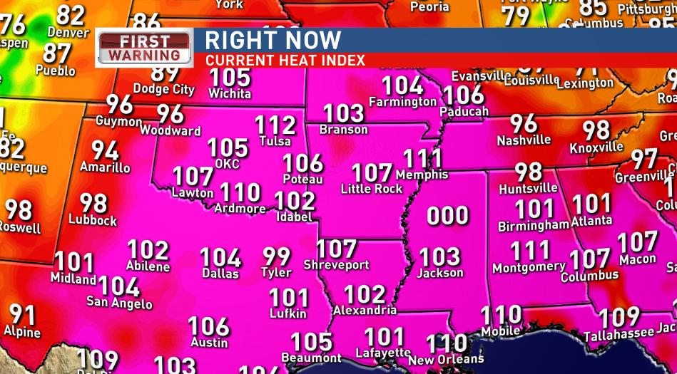
Weather Overflows
Twice recently I have seen weather so unusual that the software designed to show weather failed.
The first was Hurricane Orphelia that went outside the range hurricanes are expected in. It went further north than the software was able to map

The second was this week where Mississippi got so hot (121F) that the temperature map could not show it and flipped over to 000.

The first was Hurricane Orphelia that went outside the range hurricanes are expected in. It went further north than the software was able to map

The second was this week where Mississippi got so hot (121F) that the temperature map could not show it and flipped over to 000.
Friday, March 22, 2019
Ireland Population Density Maps
Data from https://ec.europa.eu/eurostat/
Color Maps


Joyplots
Where population density is seen as an increase in height.


Other Countries


Wednesday, March 20, 2019
Heatmap of the world
On the 14th of June 2016 I made a heatmap of global temperatures since 1850.
This got popular on reddit with 15.4K points

The picture as I said in the first comment on the post was inspired by Ed Hawkins spiral animation of world temperatures and was an attempt to show everything in one picture.
A few outlets picked up the picture. The weather channel put it on facebook without crediting me.

Tableau I found out last year use it to advertise themselves but with no credit to me the original design


Ed Hawkins tweeted about the graph

And in June 2016 we discussed further as I switched Time to the Y axis and made other changes. My point is he tweeted about "'heat-map' representation of global temperature changes since 1850" two years before he published his heat map representation (using stripes). My graphs used the Hadcrut-4 and HadCET datasets


In May 2018 he produced a climate graph (below) with only years not months in the heatmap. At no point has he said that my heatmaps (which were inspired by his global temperatures spiral animation) might have inspired him.

I had produced a heatmap graph with lines for years that he saw in Sept 2017

Hawkins graph has deservidely become famous. And heatmaps are one of the most common visualisation types, which is evidence he could have come up with it on his own anyway. I would like if my ones did inspire him that it got mentioned somewhere. But the big deal here is that global warming is being shown in a popular eye catching way.
Monday, February 25, 2019
February is Hot
At the moment it is really hot. 20°C is ridiculously hot for this time of year.
Central England has weather data going back a long time. 1772 for daily average temperature and 1878 for maximum and minimum temperatures on each day.
2 times February the 25th since 1772 had an average temperature for the day above 10°C in Central England 1790 with 10.7°C, and 1922 with 11°C
The maximum temperatures observed in central England on the 25th of February were 1922 with 14.1,1953 with 13.1 and 1976 with 13.1 For those 140 years the maximum daily temperature averaged 6.6C.
I put the code to work all this out here. Graph of Feb 25th max temperature shows how weird 20°C is


It takes a while for the HADCET data to be updated. There is a nearby weatherstation http://www.weathercast.co.uk/world-weather/weather-stations/obsid/99060.html when I figure out the relationship between the two it will be possible to do a comparison between today and all the previous years.
Tuesday, February 05, 2019
English soccer is not normal
Are wins in football normally distributed? If they are not it might affect how we should calculate the probabilities of teams winning.
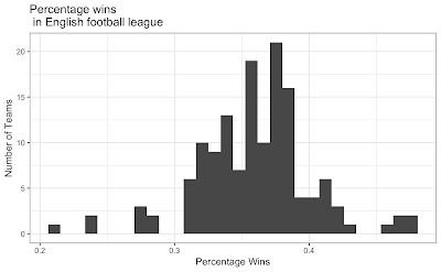
Baseball wins seem not to follow a normal distribution
There is a great R Package dataset of football results by James Curley here. This engsoccerdata has a function to generate soccer league tables of many countries over a long time period.
league<-maketable_all(df=england[,])
team GP W D L gf ga gd Pts Pos
1 Manchester United 962 604 209 149 1856 847 1009 2021 1
and create a new column for the percentage of wins
       league<-league %>%
    mutate(PercentW = W / GP)

p<-ggplot(data=league, aes(league$PercentW)) + geom_histogram()
#binwidth=20
p<-p + ggtitle("Percentage wins\n in English football league") +   xlab("Percentage Wins") + ylab("Number of Teams")
p<-p+theme_update(plot.title = element_text(hjust = 0.5))
p<-p + theme_bw()

       library(fitdistrplus)
library(logspline)
x<-league$PercentW
fit.norm <- fitdist(x, "norm")
plot(fit.norm)
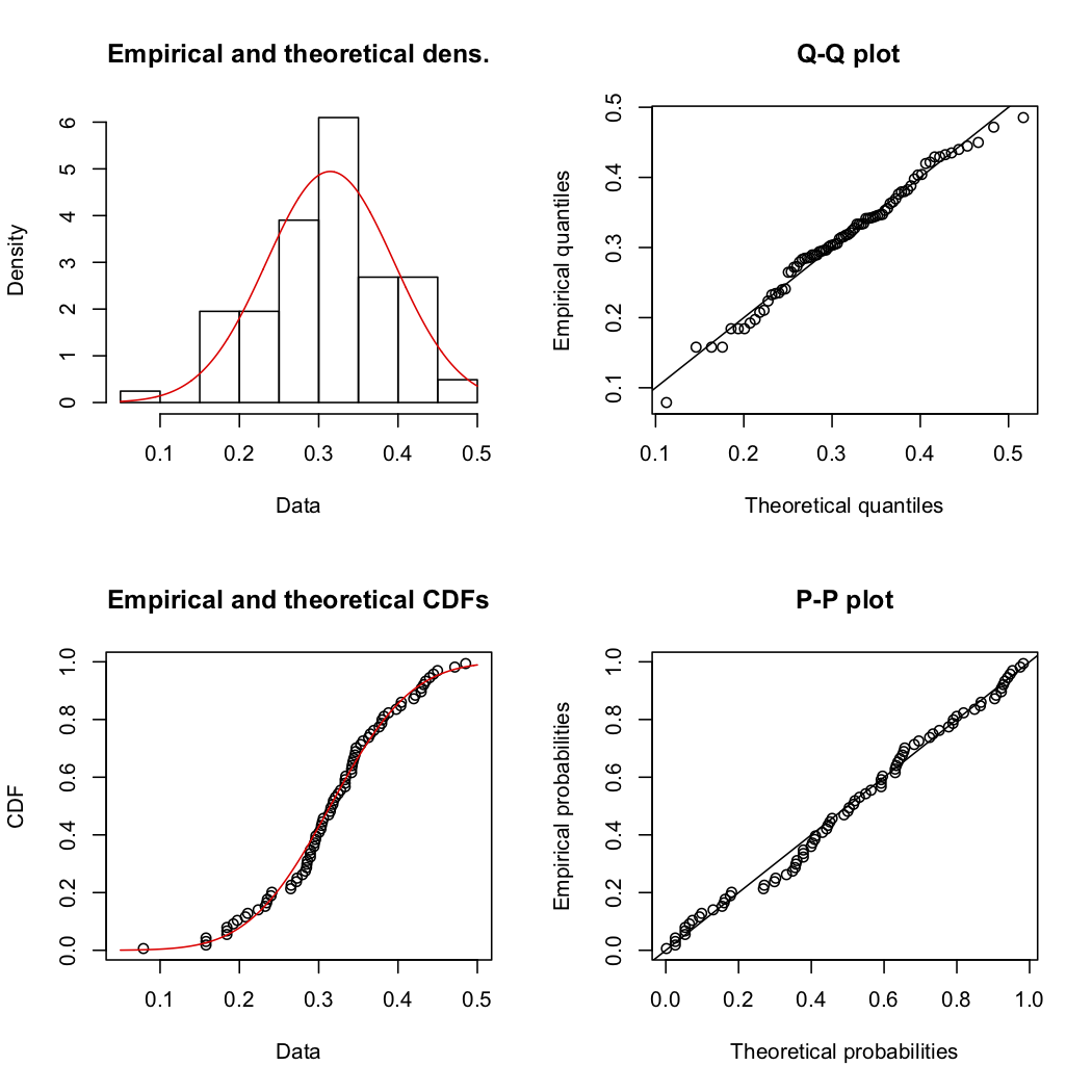
shapiro.test(x)
Shapiro-Wilk normality test
data: x W = 0.96276, p-value = 0.0006663 Which means English football wins really do not have a normal distribution.
Goals per game are also not normally distributed. But I dont think anyone expectes them to be
league<-league %>%
    mutate(GoalsPgame = gf / GP)
shapiro.test(league$GoalsPgame)
Shapiro-Wilk normality test data: x W = 0.92134, p-value = 4.818e-07
And for France
Shapiro-Wilk normality test
data: leagueF$PercentW
W = 0.98522, p-value = 0.4699 so French football wins do not have might have (thanks for Paulfor the correction in the comments) a normal distribution. I must check the other leagues in the dataset as behaviour this different is odd.

Thursday, January 10, 2019
The Oldest Irishman Joke
John Scotus Eriugena (c. 815 – c. 877) was on the five punt note. And won a Michael D Higgins look alike competition in 870AD.
The French king sat opposite him and asked.
'Quid distat inter sottum et Scottum?' (What separates a sot [drunkard] from an Irishman?),
Eriugena replied, 'Tabula tantum' (Only a Table).
I think the gag setup still works 1200 years later.
What separates man from the animals?
The Liffey

Sunday, January 06, 2019
Ireland Carbon reduction by 2030
How are we going to meet Ireland's carbon reduction aims in the next eleven years?
How much do we need to reduce Carbon by?
We have committed to 'reducing greenhouse gas emissions by 40 per cent (compared to 1990 levels)'. Which is 60% of 56 million tonnes our carbon output by 40%. Which is 33.6 million tonnes of around 42.5% of our current carbon usage.
How would we do this?
On a personal level not an industrial one what would I have to do to reduce my carbon output by 40%? Please correct me if I am wrong here but roughly it seems to be
1. Get rid of my car. (as seen in Show Table: 2.5) 20% of our carbon output is Transport. Electric cars do not seem to be vastly more efficient than petrol ones.
2. Become Vegan. This seems to reduce food Carbon by about 40% .
3. Insulate the house and install energy efficient appliances. This seems to make less impact than cars and meat.
4. Sign up to airtricity. This one is easy enough.
How would this happen?
This all seems asking a lot. On transport Public transport subsidies would have to increase massively immediately. Even then 30% of Irish people live in the countryside which is really hard to do without a car.
It could be that rewilding the countryside means that we do not need to reduce carbon outputs by as much. But that would be a huge undertaking by itself.
Why is all this not being talked about? If I am totally wrong here please explain in the comments how to reduce by 40% in an easier way. If it is that we have to go vegan, live in cities and massively boost public transport starting immediately that seems to be a massive task.
Subscribe to:
Posts (Atom)