Friday, March 22, 2019
Ireland Population Density Maps
Wednesday, March 20, 2019
Heatmap of the world
The picture as I said in the first comment on the post was inspired by Ed Hawkins spiral animation of world temperatures and was an attempt to show everything in one picture.
A few outlets picked up the picture. The weather channel put it on facebook without crediting me.
Tableau I found out last year use it to advertise themselves but with no credit to me the original design
Ed Hawkins tweeted about the graph
And in June 2016 we discussed further as I switched Time to the Y axis and made other changes. My point is he tweeted about "'heat-map' representation of global temperature changes since 1850" two years before he published his heat map representation (using stripes). My graphs used the Hadcrut-4 and HadCET datasets
In May 2018 he produced a climate graph (below) with only years not months in the heatmap. At no point has he said that my heatmaps (which were inspired by his global temperatures spiral animation) might have inspired him.
I had produced a heatmap graph with lines for years that he saw in Sept 2017
Hawkins graph has deservidely become famous. And heatmaps are one of the most common visualisation types, which is evidence he could have come up with it on his own anyway. I would like if my ones did inspire him that it got mentioned somewhere. But the big deal here is that global warming is being shown in a popular eye catching way.
Monday, February 25, 2019
February is Hot
Central England has weather data going back a long time. 1772 for daily average temperature and 1878 for maximum and minimum temperatures on each day.
2 times February the 25th since 1772 had an average temperature for the day above 10°C in Central England 1790 with 10.7°C, and 1922 with 11°C
The maximum temperatures observed in central England on the 25th of February were 1922 with 14.1,1953 with 13.1 and 1976 with 13.1 For those 140 years the maximum daily temperature averaged 6.6C.
I put the code to work all this out here. Graph of Feb 25th max temperature shows how weird 20°C is
It takes a while for the HADCET data to be updated. There is a nearby weatherstation http://www.weathercast.co.uk/world-weather/weather-stations/obsid/99060.html when I figure out the relationship between the two it will be possible to do a comparison between today and all the previous years.
Tuesday, February 05, 2019
English soccer is not normal
Baseball wins seem not to follow a normal distribution
There is a great R Package dataset of football results by James Curley here. This engsoccerdata has a function to generate soccer league tables of many countries over a long time period.
league<-maketable_all(df=england[,])
team GP W D L gf ga gd Pts Pos
1 Manchester United 962 604 209 149 1856 847 1009 2021 1
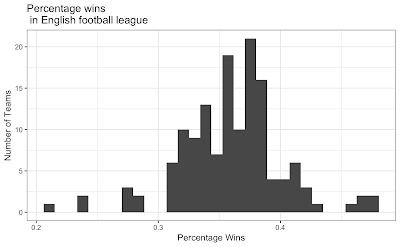
and create a new column for the percentage of wins
league<-league %>%
mutate(PercentW = W / GP)
p<-ggplot(data=league, aes(league$PercentW)) + geom_histogram()
#binwidth=20
p<-p + ggtitle("Percentage wins\n in English football league") + xlab("Percentage Wins") + ylab("Number of Teams")
p<-p+theme_update(plot.title = element_text(hjust = 0.5))
p<-p + theme_bw()
library(fitdistrplus)
library(logspline)
x<-league$PercentW
fit.norm <- fitdist(x, "norm")
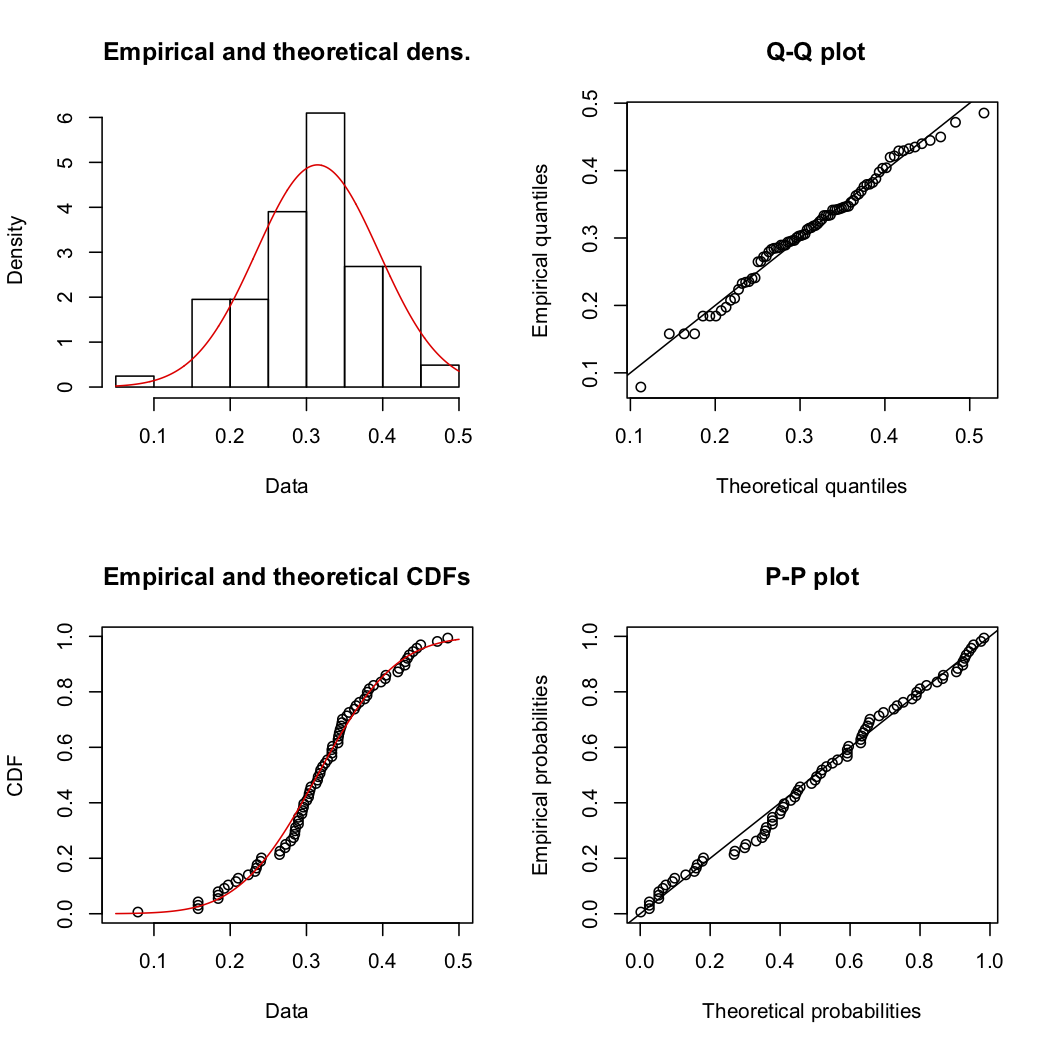
plot(fit.norm)
shapiro.test(x)
Shapiro-Wilk normality test
data: x W = 0.96276, p-value = 0.0006663 Which means English football wins really do not have a normal distribution.
Goals per game are also not normally distributed. But I dont think anyone expectes them to be
league<-league %>%
mutate(GoalsPgame = gf / GP)
shapiro.test(league$GoalsPgame)
Shapiro-Wilk normality test data: x W = 0.92134, p-value = 4.818e-07
And for France
Shapiro-Wilk normality test
data: leagueF$PercentW
W = 0.98522, p-value = 0.4699 so French football wins do not have might have (thanks for Paulfor the correction in the comments) a normal distribution. I must check the other leagues in the dataset as behaviour this different is odd.