Showing posts with label visualization. Show all posts

Thursday, May 21, 2026

Should I get an attribution here?

I made a timeline of all the people in We Didn't Start the fire when Bridget Bardot passed away. It got popular and put in newspaper stories.


Then three weeks later Nathan Yau makes a timeline of all the people in We Didn't Start the Fire and uses the Bardot passing hook my graph had. But he never mentions my graph 


His graph has a few ideas I am going to take to improve my next version. And Yau wrote the first visualisation book I ever read so I do owe him a lot.


This is my previous post about all the news outlets that took the graph itself and never contacted me.


It is polite to reference 'this idea came from this graph' or to send a message to the originator of an idea and it did not happen in this case.

Tuesday, March 25, 2025

Doctor Deaths in the Famine

During the famine doctors cared that many of their number were dying. the collected data and wrote up their findings in the The Dublin quarterly journal of medical science Volume 5, 1848. in the section Art. VII. — On the Mortality of Medical Practitioners in Ireland. Second Article. By James William Cusack, M. D. President of the Royal College of Surgeons, and William Stokes, M. D., Regius Professor of Physic in the University of Dublin.


These data tables seem never to have been graphed before. But now using OCR it is really easy to extract the data.
Here for the first time ever is graphs of what doctors recorded as killing them


A python notebook to make these is here and data here.

Wednesday, March 20, 2019

Heatmap of the world

On the 14th of June 2016 I made a heatmap of global temperatures since 1850. This got popular on reddit with 15.4K points


The picture as I said in the first comment on the post was inspired by Ed Hawkins spiral animation of world temperatures and was an attempt to show everything in one picture.
A few outlets picked up the picture. The weather channel put it on facebook without crediting me.


Tableau I found out last year use it to advertise themselves but with no credit to me the original design


Ed Hawkins tweeted about the graph


And in June 2016 we discussed further as I switched Time to the Y axis and made other changes. My point is he tweeted about "'heat-map' representation of global temperature changes since 1850" two years before he published his heat map representation (using stripes). My graphs used the Hadcrut-4 and HadCET datasets


In May 2018 he produced a climate graph (below) with only years not months in the heatmap. At no point has he said that my heatmaps (which were inspired by his global temperatures spiral animation) might have inspired him.


I had produced a heatmap graph with lines for years that he saw in Sept 2017


Hawkins graph has deservidely become famous. And heatmaps are one of the most common visualisation types, which is evidence he could have come up with it on his own anyway. I would like if my ones did inspire him that it got mentioned somewhere. But the big deal here is that global warming is being shown in a popular eye catching way.


Monday, February 25, 2019

February is Hot

At the moment it is really hot. 20°C is ridiculously hot for this time of year.

Central England has weather data going back a long time. 1772 for daily average temperature and 1878 for maximum and minimum temperatures on each day.

2 times February the 25th since 1772 had an average temperature for the day above 10°C in Central England 1790 with 10.7°C, and 1922 with 11°C

The maximum temperatures observed in central England on the 25th of February were 1922 with 14.1,1953 with 13.1 and 1976 with 13.1 For those 140 years the maximum daily temperature averaged 6.6C.

I put the code to work all this out here. Graph of Feb 25th max temperature shows how weird 20°C is

It takes a while for the HADCET data to be updated. There is a nearby weatherstation http://www.weathercast.co.uk/world-weather/weather-stations/obsid/99060.html when I figure out the relationship between the two it will be possible to do a comparison between today and all the previous years.

Friday, January 13, 2017

Irish Election Spending 2016

In the Irish election 2016 who paid the most for each vote and for each seat?
8394832.89 total spending (report here) Electorate: 3305110 so €2.50 was spent on each vote. That is under half what is spend on a US presidential vote.
On a per seat and per vote basis

And on a Per Seat Basis


Party,"Votes,1st pref.",Seats,Spending
Fine Gael,544140,50,2768881.50
Fianna Fáil,519356,44,1687916.29
Sinn Féin,295319,23,650190.38
Labour Party,140898,7,1083718.38
AAA–PBP,84168,6,266942.48
Ind 4 Change,31365,4,51669.18
Social Dem,64094,3,190586.93
Green Party,57999,2,146792.27
and the r package code is

data <-  read.csv("spending.csv", header=TRUE)
datat <- mutate(data, perV = Spending/Votes.1st.pref., perS= Spending/Seats)

q<-  ggplot(data=datat, aes(x=Party, y=perV, fill=Party)) + geom_bar(stat="identity") +      scale_fill_manual(values=c("#E5E500", "#66BB66", "#6699FF", "#99CC33", "#FFC0CB","#CC0000", "#008800", "#752F8B"))
q <-q + theme(axis.text.x = element_text(angle = 90, hjust = 1))
q <-q + theme(legend.position="none")
q <-q + labs(title = "General Election Spending 2016")
q <-q + labs(y = "Euros Per Vote")

q<-  ggplot(data=datat, aes(x=Party, y=perS, fill=Party)) + geom_bar(stat="identity") +      scale_fill_manual(values=c("#E5E500", "#66BB66", "#6699FF", "#99CC33", "#FFC0CB","#CC0000", "#008800", "#752F8B"))
q <-q + theme(axis.text.x = element_text(angle = 90, hjust = 1))
q <-q + theme(legend.position="none")
q <-q + labs(title = "General Election Spending 2016")
q <-q + labs(y = "Euros Per Seat")


Thursday, May 19, 2016

Dying at Work in the US

Dataset from the Occupational Safety & Health Administration, OHSA, track workplace fatalities in the US. They have CSVs records of the workplace deaths a year in the US, that they release publicly.

The data contains the date, location and a description for 4000 fatalities over five years. I created columns for state, zipcode, number of people and cause.

The most common interesting words in these descriptions are

  • 813 fell
  • 708 struck
  • 642 truck
  • 452 falling
  • 382 crushed
  • 352 head
  • 263 roof
  • 261 tree
  • 258 electrocuted
  • 244 ladder
  • 238 vehicle
  • 226 trailer
  • 197 machine
  • 186 collapsed
  • 180 forklift

Not common but interesting

  • 10 lightning
  • 48 shot
  • 4 dog
  • 2 bees

and here is a map I made of the states where they happen

I have created a repository to try augment the OSHA data and clean it up when errors are found.

The repository is on github here.

If you use it I'll give you edit rights and you can help improve it

Friday, January 22, 2016

England's Temperature in 2015

Nine days in 2015 were the hottest for that day of the year since 1772. This compares to three in 2014, though 2014 had a hotter average temperature and was the hottest year on record in the UK.

England has a collected data on daily temperature from 1772 in the Hadley Centre Central England Temperature (HadCET) dataset.

I downloaded this Hadley Centre dataset. And I followed this tutorial. Based on an original graphic by Tufte.


Here the black line is the average temerature for each day last year. The dark line in the middle is the average average temperature (95% confidence). the staw coloured bigger lines represent the highest and lowest average daily temperature ever recorded on that day since 1772. the red dots are the days in 2015 that were hotter than any other day at that time of year since 1772.

Looking at the black line that represents last years temperatures it was the Winter and Autumn that were far above average. Instead of a scorching hot summer most of the record hot days were in November and December. 2014 had the same pattern of a hot Winter. No day in 2015 was the coldest for that date in the recorded time.

Tuesday, November 17, 2015

How Good Will the Upcoming Stephen King Adaptations be?

This is the third and final post in a series on Stephen King adaptations. (The first is Are Stephen King films better than the books?, and the second Do Stephen King's Better Books Make Better Films?)
According to IMDB the Stephen King Novels below are currently being adapted
Titlegood doubled
The Talisman8.2
Rose Madder7.22
Lisey's Story7.22
Mr. Mercedes7.74
Gerald's Game6.86
Cell7.22
11.22.638.52
The Dark Tower8
Three of these books have exactly the same rating on Goodreads. The correlation between the ratings and his books and his films previously discussed I will use to predict future movies ratings. The analysis gives a 95% confidence prediction intervals of
Titleestimatelower boundupper bound
The Talisman7.56.48.6
Rose Madder5.954.87.0
Lisey's Story5.954.87.0
Mr. Mercedes6.795.78.8
Gerald's Game5.374.26.4
Cell5.954.87.0
11.22.638.056.99.15
The Dark Tower7.26.18.2
The upcoming films with their predicted IMDB ratings are in red in the graph below. Three are predicted to have a rating of 5.95.

There is an interesting 538 podcast here about a company that predicts film earnings. He mentions the correlation between film quality and earnings and film quality. This whole topic is an interesting challenge for prediction.

Stephen King is unique among authors in the number and variety of adaptations his works have gone through. So he is possibly the only author this could be even tried with. I am really looking forward to 11.22.63 and the Talisman now. And if Gerald's Game beats the predicted IMDB score that is a bonus.


Code


mydata = read.csv("King.csv")  
library(ggplot2)
attach(mydata)     # attach the data frame 
king.lm = lm(imdb ~ good.doubled)

Call:
lm(formula = imdb ~ good.doubled)

Coefficients:
 (Intercept)  good.doubled  
      -5.821         1.628  

upcoming = read.csv("upcoming.csv")  
predict(king.lm, upcoming, interval="predict")

> predict(king.lm, upcoming, interval="predict")

Title,Publication date,Pages,imdb,goodreads,good doubled,clr
Carrie,05/04/1974,199,7.4,3.89,7.78,1
Salem's Lot,17/10/1975,439,6.8,3.97,7.94,1
The Shining,28/01/1977,447,8.4,4.12,8.24,1
The Stand,Sep-78,823,7.3,4.32,8.64,1
The Dead Zone,Aug-79,428,7.3,3.88,7.76,1
Firestarter,29/09/1980,426,6,3.8,7.6,1
Cujo,08/09/1981,319,6,3.61,7.22,1
The Running Man,May-82,219,6.6,3.74,7.48,1
Christine,29/04/1983,526,6.6,3.69,7.38,1
Pet Sematary,14/11/1983,374,6.6,3.86,7.72,1
Thinner,19/11/1984,309,5.7,3.6,7.2,1
It,15/09/1986,1138,6.9,4.12,8.24,1
Misery,08/06/1987,310,7.8,4.06,8.12,1
The Tommyknockers,10/11/1987,558,5.4,3.42,6.84,1
The Dark Half,20/10/1989,431,5.9,3.71,7.42,1
Needful Things,Oct-91,690,6.2,3.84,7.68,1
Dolores Claiborne,Nov-92,305,7.4,3.76,7.52,1
The Green Mile,March–August 1996,400,8.5,4.39,8.78,1
Bag of Bones,22/09/1998,529,5.8,3.84,7.68,1
Dreamcatcher,20/03/2001,620,5.5,3.53,7.06,1
Under the Dome,10/11/2009,1074,6.8,3.89,7.78,1
Shawshank Redemption,10/11/2009,181,9.3,4.51,9.02,1
Stand by me,10/11/2009,80,8.1,4.25,8.5,1
The Mist,10/11/2009,230,7.2,3.88,7.76,1
The Langoliers,10/11/2009,230,6.1,3.71,7.42,1
Apt Pupil,1983,179,6.7,3.8,7.7,1
Hearts in Atlantis,2000,640,6.9,3.77,7.54,1
The Talisman,na,na,7.5,4.1, 8.2,2
Rose Madder,na,na,5.95,3.61, 7.22,2
Lisey's Story,na,na,5.95,3.61, 7.22,2
Mr. Mercedes,na,na,6.79,3.87, 7.74,2
Gerald's Game,na,na,5.37,3.43, 6.86,2
Cell,na,na,5.95,3.61, 7.22,2
11.22.63,na,na,8.05,4.26, 8.52,2
The Dark Tower,na,na,7.2,4,8,2


mydata = read.csv("King.csv")
attach(mydata)
p1 <- ggplot(mydata, aes(x=good.doubled, y=imdb)) +
    geom_point(colour = factor(clr),shape=1,size=2) +    # Use hollow circles
    geom_smooth(method=lm,se=FALSE)           
            
p1 <- p1 + ylab("IMDB Ratings")  
p1 <- p1 + xlab("GoodReads Ratings")  
p1 <- p1 + ggtitle("Upcoming Stephen King Adaptations")
p1 <- p1 + annotate("text", x = 6.97, y = 5.26, label = "The Tommyknockers", size=3, colour="blue3")  
p1 <- p1 + annotate("text", x = 7.85, y = 7.42, label = "Carrie", size=3, colour="blue3") 
#Salem's Lot,17/10/1975,439,6.8,3.97,7.94,1
p1 <- p1 + annotate("text", x =8.0 , y =6.9, label = "Salem's Lot", size=3, colour="blue3") 
p1 <- p1 + annotate("text", x = 7.8, y = 6.5, label = "Pet Sematary", size=3, colour="blue3") 
p1 <- p1 + annotate("text", x = 8.34, y = 8.51, label = "The Shining", size=3, colour="blue3") 
p1 <- p1 + annotate("text", x = 8.62, y = 8.2, label = "Stand By Me", size=3, colour="blue")
p1 <- p1 + annotate("text", x = 8.9, y = 8.4, label = "The Green Mile", size=3, colour="blue3") 
p1 <- p1 + annotate("text", x = 9.0, y = 9.09, label = "Shawshank\nRedemption" , size=3, colour="blue3") 
p1 <- p1 + annotate("text", x = 8.75, y = 7.3, label = "The Stand", size=3, colour="blue3") 
p1 <- p1 + annotate("text", x = 8.27, y = 6.85 , label = "It", size=3, colour="blue3") 
p1 <- p1 + annotate("text", x = 8.19, y = 7.74, label = "Misery", size=3, colour="blue3") 
p1 <- p1 + annotate("text", x = 8.05, y = 6.7, label = "Under the Dome", size=3, colour="blue3") 
#Under the Dome,10/11/2009,1074,6.8,3.89,7.78,1
p1 <- p1 + annotate("segment", x = 7.9, xend = 7.79, y = 6.7, yend = 6.8, colour = "blue3") 
#Dolores Claiborne,Nov-92,305,7.4,3.76,7.52,1
p1 <- p1 + annotate("text", x = 7.5, y = 7.3, label = "Dolores Claiborne", size=3, colour="blue3") 
#The Dark Half,20/10/1989,431,5.9,3.71,7.42,1
p1 <- p1 + annotate("text", x = 7.5, y = 5.81, label = "The Dark Half", size=3, colour="blue3")
#Bag of Bones,22/09/1998,529,5.8,3.84,7.68,1
p1 <- p1 + annotate("text", x = 7.78, y = 5.7, label = "Bag of Bones", size=3, colour="blue3")
#The Dead Zone,Aug-79,428,7.3,3.88,7.76,1
p1 <- p1 + annotate("text", x = 7.5, y = 7.72, label = "The Dead Zone", size=3, colour="blue3")
p1 <- p1 + annotate("segment", x = 7.76, xend = 7.5, y = 7.33, yend = 7.66, colour = "blue3") 
#The Mist,10/11/2009,230,7.2,3.88,7.76,1
p1 <- p1 + annotate("text", x = 7.76, y = 7.1, label = "The Mist", size=3, colour="blue3")
#Firestarter,29/09/1980,426,6,3.8,7.6,1
p1 <- p1 + annotate("text", x = 7.71, y = 6, label = "Firestarter", size=3, colour="blue3")
#The Langoliers,10/11/2009,230,6.1,3.71,7.42,1
p1 <- p1 + annotate("text", x = 7.56, y = 6.11, label = "The Langoliers", size=3, colour="blue3")
#Cujo,08/09/1981,319,6,3.61,7.22,1
p1 <- p1 + annotate("text", x = 7.23, y = 6.1, label = "Cujo", size=3, colour="blue3")
#The Running Man,May-82,219,6.6,3.74,7.48,1
p1 <- p1 + annotate("text", x = 7.48, y = 6.7, label = "The Running Man", size=3, colour="blue3")
#Christine,29/04/1983,526,6.6,3.69,7.38,1
p1 <- p1 + annotate("text", x = 7.38, y = 6.5, label = "Christine", size=3, colour="blue3")
#Thinner,19/11/1984,309,5.7,3.6,7.2,1
p1 <- p1 + annotate("text", x = 7.25, y = 5.6, label = "Thinner", size=3, colour="blue3")
#Needful Things,Oct-91,690,6.2,3.84,7.68,1
p1 <- p1 + annotate("text", x = 7.83, y = 6.2, label = "Needful Things", size=3, colour="blue3")
#Dreamcatcher,20/03/2001,620,5.5,3.53,7.06,1
p1 <- p1 + annotate("text", x = 7.2, y = 5.5, label = "Dreamcatcher", size=3, colour="blue3")
#The Talisman,na,na,7.52,4.1, 8.2,2
p1 <- p1 + annotate("text", x = 8.36, y = 7.52, label = "The Talisman", size=3, colour="red3")
#Rose Madder,na,na,5.93,3.61, 7.22,2
p1 <- p1 + annotate("text", x = 7.07, y = 5.93, label = "Rose Madder", size=3, colour="red3")
#Lisey's Story,na,na,5.93,3.61, 7.22,2
p1 <- p1 + annotate("text", x = 7.07, y = 6.05, label = "Lisey's Story", size=3, colour="red3")
#Mr. Mercedes,na,na,6.78,3.87, 7.74,2
p1 <- p1 + annotate("text", x = 7.60, y = 6.81, label = "Mr. Mercedes", size=3, colour="red3")
#Gerald's Game,na,na,5.34,3.43, 6.86,2
p1 <- p1 + annotate("text", x = 7.03, y = 5.36, label = "Gerald's Game", size=3, colour="red3")
#Cell,na,na,5.93,3.61, 7.22,2
p1 <- p1 + annotate("text", x = 7.28, y = 5.92, label = "Cell", size=3, colour="red3")
#11.22.63,na,na,8.05,4.26, 8.52,2
p1 <- p1 + annotate("text", x = 8.63, y = 8.05, label = "11.22.63", size=3, colour="red3")
#The Dark Tower,na,na,7.2,4,8,2
p1 <- p1 + annotate("text", x = 8.16, y = 7.2, label = "The Dark Tower", size=3, colour="red3")
p1 <- p1 + ylab("IMDB Ratings")  
p1 <- p1 + xlab("GoodReads Ratings")
p1
ggsave("plot.png", width=10, height=10, dpi=100)
detach(mydata)

Friday, November 13, 2015

Do Stephen King's Better Books Make Better Films?

My last post (and data) got a bit popular on reddit. Some people noticed that Stephen King films ratings and the books ratings seemed highly correlated.

I think Max is right on this. So I made a graph showing how movie and book ratings are correlated

Now the actual correlation figure is


 cor(good.doubled, imdb, use="complete")
[1] [1] 0.8766 so it looks like highly rated King books make highly rated films

It could be that a good film makes people read and rate highly a book. But my basic conclusion is Stephen King's highly rated books make higher rated films


Appendix: Code for the Graph


mydata = read.csv("King.csv")
attach(mydata)
cor(good.doubled, imdb, use="complete")
p1 <- ggplot(mydata, aes(x=good.doubled, y=imdb)) +
    geom_point(shape=1) +    # Use hollow circles
    geom_smooth(method=lm,   # Add linear regression line
                se=FALSE)    # Don't add shaded confidence region
p1 <- p1 + ylab("IMDB Ratings")  
p1 <- p1 + xlab("GoodReads Ratings *2")  
p1 <- p1 + ggtitle("Stephen King: Books vs. Movies Correlation")
p1 <- p1 + geom_text(aes(label=ifelse(good.doubled>0,as.character(Title),'')),hjust=0,just=0,size=2, position = "jitter")
p1
ggsave("correlate.png")


Other Correlations I changed the publication data column into a column of Years since 1974.


 cor(good.doubled, Years, use="complete")
[1] -0.1879052 Not a strong correlation about Kings adapted books get better or worse since he started
> cor(good.doubled, Pages, use="complete")
[1] -0.02715659 no relationship between the length of a book and it being rated highly or lowly.
> cor(Years, Pages, use="complete")
[1] 0.482048 King's adapted books may be getting a bit longer over time

Wednesday, November 11, 2015

Are Stephen King films better than the books?

Rejoice, Snobs: The Book IS Better Than The Movie
The literary originals have higher ratings than the film adaptations 74 percent of the time
. This recent piece claims books are usually better than their films versions.

This article reminded me of a claim that Stephen King films are better than his books. So I extracted the ratings from IMDB and Goodreads. I doubled the Goodreads ratings to make them out of 10.


I included miniseries. Carrie was made twice but I only included the original. The Langoliers, Maximum Overdrive, Lawnmower man and Secret garden seem not to have independent English language printed book versions.


The Shining is one of two films with a higher rating than the book. King famously hates the film

"Are you mystified by the cult that's grown around Kubrick's Shining?
I don't get it. But there are a lot of things that I don't get. But obviously people absolutely love it, and they don't understand why I don't. The book is hot, and the movie is cold; the book ends in fire, and the movie in ice."


To make this a fair test films and book would have to be graded on a curve. By what the average rating of each is. There is a good discussion on how to normalise the original comparison here. But I think this graph is enough to show Stephen King books are better than his films.

Less than 8% of King adaptations are rated higher compared to 26% usually for book adaptations. To get King to have the average quality of adaptations, sixish Stephen King Films being rated better than is books. This would require Dolores Claiborne, The Green Mile, Stand By Me, Misery and maybe Carrie to be much worse books or these already highly rated films to be much better. I am going to call this Myth Busted*, Stephen King adaptations are less successful than the average adaptation.


TitlePublication datePagesimdbgoodreadsgood doubled
CarrieApril 5, 19741997.43.897.78
'Salem's LotOctober 17, 19754396.83.977.94
The ShiningJanuary 28, 19774478.44.128.24
The StandSep-788237.34.328.64
The Dead ZoneAug-794287.33.887.76
FirestarterSeptember 29, 198042663.87.6
CujoSeptember 8, 198131963.617.22
The Running ManMay-822196.63.747.48
ChristineApril 29, 19835266.63.697.38
Pet SemataryNovember 14, 19833746.63.867.72
ThinnerNovember 19, 19843095.73.67.2
ItSeptember 15, 198611386.94.128.24
MiseryJune 8, 19873107.84.068.12
The TommyknockersNovember 10, 19875585.43.426.84
The Dark HalfOctober 20, 19894315.93.717.42
Needful ThingsOct-916906.23.847.68
Dolores ClaiborneNov-923057.43.767.52
The Green MileMarch–August 19964008.54.398.78
Bag of BonesSeptember 22, 19985295.83.847.68
DreamcatcherMarch 20, 20016205.53.537.06
Under the DomeNovember 10, 200910746.83.897.78
Shawshank Redemption19821819.34.519.02
Stand by me1982808.14.258.5
The Mist19832307.23.887.76
Apt Pupil19831796.73.87.7
Hearts in Atlantis20006406.93.777.54

   
 mydata = read.csv("King.csv")  
 library(ggplot2)  
 p1 <- ggplot(mydata, aes(x = good.doubled, y = imdb))  
 p1 <- p1 + geom_abline(intercept=0, slope=1)  
 p1 <- p1 + geom_point(shape=1)  
 p1 <- p1 + ylim(5, 10)  
 p1 <- p1 + xlim(5, 10)  
 
 p1 <- p1 + ylab("IMDB Ratings")  
 p1 <- p1 + xlab("GoodReads Ratings *2")  
 p1 <- p1 + ggtitle("Stephen King: Books vs. Movies")  

p1 <- p1 + annotate("text", x = 7.3, y = 5.3, label = "The Tommyknockers", size=3, colour="blue3")  
p1 <- p1 + annotate("text", x = 7.95, y = 7.37, label = "Carrie", size=3, colour="blue3") 
p1 <- p1 + annotate("text", x = 8, y = 6.5, label = "Pet Sematary", size=3, colour="blue3") 
p1 <- p1 + annotate("text", x = 7.9, y = 8.54, label = "The Shining", size=3, colour="red3") 
p1 <- p1 + annotate("text", x = 8.75, y = 9.4, label = "Shawshank Redemption", size=3, colour="red3")
p1 <- p1 + annotate("text", x = 9.18, y = 8.4, label = "The Green Mile", size=3, colour="blue3") 
p1 <- p1 + annotate("text", x = 8.72, y = 8, label = "Stand By Me", size=3, colour="blue3") 
p1 <- p1 + annotate("text", x = 8.92, y = 7.3, label = "The Stand", size=3, colour="blue3") 
p1 <- p1 + annotate("text", x = 8.3, y = 6.85 , label = "It", size=3, colour="blue3") 
p1 <- p1 + annotate("text", x = 8.32, y = 7.7, label = "Misery", size=3, colour="blue3") 
p1 <- p1 + annotate("text", x = 8.18, y = 6.7, label = "Under the Dome", size=3, colour="blue3") 

p1 <- p1 + annotate("text", x = 9.28, y = 5.0, label = "Books Higher Rated", size=5, colour="blue3") 
p1 <- p1 + annotate("text", x = 5.7, y = 9.90, label = "Films Higher Rated", size=5, colour="red3") 


p1 <- p1 + annotate("text", x = 6.9, y = 6, label = "Cujo", size=3, colour="blue3") 
p1 <- p1 + annotate("segment", x = 7.05, xend = 7.2, y = 6.0, yend = 6.0, colour = "blue3") 


p1 <- p1 + annotate("text", x = 6.45, y = 5.52, label = "Dreamcatcher", size=3, colour="blue3") 
p1 <- p1 + annotate("segment", x = 6.8, xend = 7.05, y = 5.5, yend = 5.5, colour = "blue3") 


p1 <- p1 + annotate("text", x = 6.80, y = 7.4, label = "Dolores Claiborne", size=3, colour="blue3")
p1 <- p1 + annotate("segment", x = 7.28, xend = 7.5, y = 7.4, yend = 7.4, colour = "blue3") 

p1 <- p1 + annotate("text", x = 7.92, y = 5.72, label = "The Dark Half", size=3, colour="blue3")
p1
ggsave("plot.png")
*This needs proper statistical significance testing so not really busted.

Monday, October 12, 2015

Stacked Area Chart In Javascript

A stacked area chart of transatlantic slave trace made with c3.js and the transatlantic slave trade database

The graph shows the counts for each region the slaves were disembarked by year. The html and javascript for this graph is on a gist here

The data used can be gotten from the slavevoyages.org website with the filters beloew

An actual graph you can play with is here and in the result tab below

Monday, June 15, 2015

When did we get too much stuff?

Kevin Kelly pointed out that we have more types of things (species of technology) than even the most wealthy had in the past. "count the number of species of technology in our household. And it came up with 6,000 different species of products. I did some research and found out that the King of England, Henry VIII, had only about 7,000 items in his household. And he was the King of England, and that was the entire wealth of England at the time." Kevin Kelly

How much more stuff can we get over time? The Argos catalog seems to get bigger each year and it seemed to me an ideal way to measure the amount of stuff we get to decide we don't want.

Retromash is a great site for old Argos catalogs. I Counted the total page numbers in each years catalog. I don't have the slaves undergraduates needed to count everything in the actual catalog. Retromash don't have much after 1990 so I went to ebay and they list the number of pages. This produces this data (with links to the ebay sources). One weirdness is there seemed to have been an instore catalog and superstore (to be delivered) catalog for a few years.

I have tried to give the number of pages of the Autumn/Winter Argos catalog you get in the shop in any given year.

The graph is just a simple ggplot2 scatterplot

mydata = read.table("argos.tsv", header=TRUE)

ggplot(mydata, aes(x=Year, y=pages)) + geom_point(shape=1) + geom_smooth(method=lm, se=FALSE)

ggsave(file="argos.png")

It looks like there are nine times the number of things we can choose now from Argos as there was in 1975. To put a prediction on this, the amount of things you can buy nearby doubles ever decade.

Sunday, April 19, 2015

England's Temperature in 2014

2014 was UK's hottest year on record, says Met Office. What does that mean on a day to day basis? England has a collected data on daily temperature from 1772 in the Hadley Centre Central England Temperature (HadCET) dataset.

According to wikipedia, last year was the hottest year in this dataset with an average temperature of 10.94 °C.

I downloaded this Hadley Centre dataset. And I followed this tutorial. Based on an original graphic by Tufte. The picture is similar to the one from my post on Dublin's 2014 Weather.


Looking at the black line that represents last years temperatures it was the winter and autumn that were far above average. Instead of a scorching hot summer the three record hot days were in October and December. No day in 2014 was the coldest for that date in the recorded time.

The wikipedia page on this dataset shows the average temperature of this dataset rising over time

Monday, March 23, 2015

Areas of Ireland that have only ever had white male TDs

There is a great map on the mirror website in the article 'The UK map of white male power' of constituencies in the UK that have only ever had white male MPs

I thought it would be interesting to see what the same map would look for Ireland. The wikipedia page for Irish Women TD's is here, from it I took the list of constituencies that have been represented by Female TDs.

Ireland has not had many non white TDs. Moosajee Bhamjee is the first non white TD as far as I know. Leo Varadkar's father is Indian. And I am probably missing many more but historical demographics suggest non white Irish politicians were rare. We had a low immigrant population until recently. To keep the graph comparable to the UK one I keep the same not 'white male' filter. Please correct me with anyone I am missing.

Taking distinct constituencies from the Female TD's wikipedia page. And a map of Irish constituencies now from here. I coloured in the constituencies I could find female TDs for in green.


For some old constituencies, like Cork Mid, I could not work out where they were. One ex-constituency Limerick City–Lmk East had a female deputy, Kathleen O'Callaghan in 1921. I took the map of where this constituency used to cover when she represented it and turned that area in the east part of Limerick-West green.
Map of Limerick City–Lmk East in 1921

Another Dublin North has completely changed its location. When Margaret Collins-O'Driscoll represented it in 1923 it covered what is now Dublin North-East. So this area is also coloured green.


The constituencies I could not find a female TD for were: Cork South-West, Limerick West and Louth. The constituencies wikipedia listed as having had a female TD are Carlow–Kilkenny, Cavan–Monaghan, Clare, Clare–Galway South,  Cork East, Cork Mid, Cork North–Central, Cork North–East, Cork North–West, Cork South–Central, Donegal North–East,   Donegal South–West,   Dublin Ballyfermot, Dublin Central, Dublin County Mid, Dublin Mid, Dublin North, Dublin North–Central,   Dublin North–West,   Dublin South, Dublin South–Central,   Dublin South–East,   Dublin South–West, Dublin St Patrick's, Dublin West, Dún Laoghaire, Galway West,   Kildare North,   Laois–Offaly,   Limerick City–Limerick East,   Limerick East, Longford–Westmeath,   Meath East,   Monaghan, Roscommon, Roscommon–Leitrim,   Sligo–Leitrim,   Tipperary North,   Tipperary South, Waterford,   Waterford County,   Westmeath,   Wexford, Wicklow .

This map looks more diverse than the UK one to me. But the proportional representation system Ireland has means we have larger constituencies with a few Members of Parliament in each. This means the same proportion of non white male Members of Parliament should cover a bigger area.
I will update this map with any corrections people give me in the comments.

Tuesday, March 03, 2015

Tree Rings and Life Expectancy

Andy Kirk here has an interesting blog post on dendrochronology and visualisation literacy.
Here is an example of a tree ring visualisation showing how over time the tree grows and leaves down rings.


I am going to visualise another time series expected lifespan.
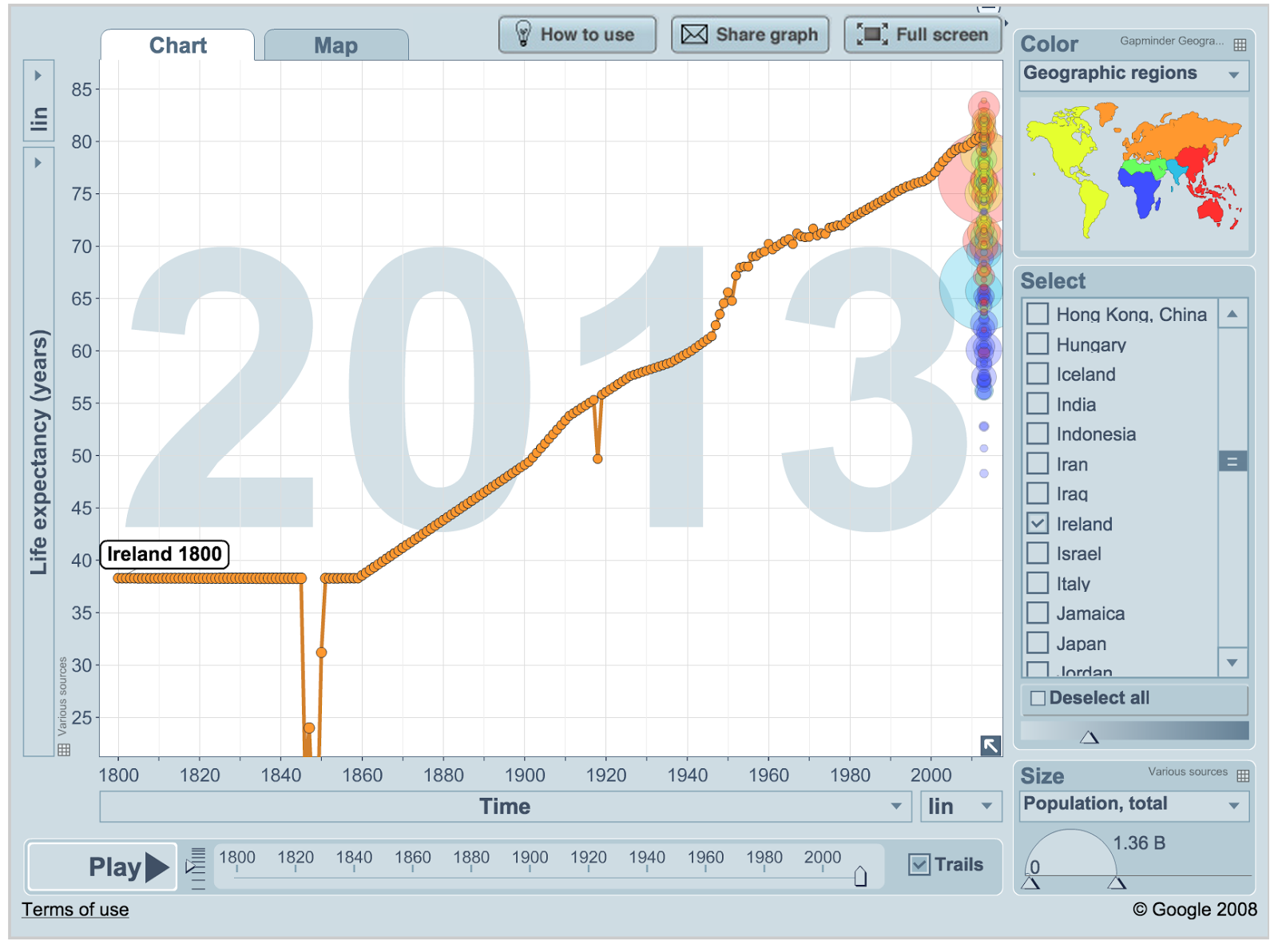
Gapminder uses a line graph to visualise life expectancy over time. I downloaded the life expectancy data from gapminder.


The interesting points here are the famine where the life expectancy dropped from an estimated 38.3 to 14.1. Also the 1918 flu epidemic causes an obvious drop from 55.3 in 1917 to 49.68 and back to 55.8 in 1919.
I use this data to create a graph using the code below. The idea is like tree rings except that instead of each line laid down in a particular year each line represents the life expectancy in that year.


The size of each ring should be a good representation on the number of years people could expect to live in that year. However I just multiplied the years given by Gapminder *6 to give the number of pixels each circles radius should be. A proper visualisation has to be more careful not to distort the number than this. Roughly, living twice as long should look like a tree that is twice as big.

The code to create this graph in a canvas element of a webpage if here. So what do you think, does this visualisation show increase in lifespan in the last 200 years well?

Saturday, February 28, 2015

What Colour are Books?

What colour are famous books?

Colours Used I counted up the occurrence of the
colours = ["red","orange","yellow","green","blue","purple","pink","brown","black","gray","white", "grey"]
in Ulysses by James Joyce. I'll post the word count code soon

red 113, orange 12, yellow 50, green 98, blue 82, purple 17, pink 21, brown 59, black 146, gray 2, white 163, grey 68

Turned this count into a barchart with r package ggplot2 graphing package

library(ggplot2)
df <- data.frame(colours = factor(c("pink","red","orange","yellow","green","blue","purple", "brown", "black", "white", "grey"), levels=c("pink","red","orange","yellow","green","blue","purple","brown", "black", "white", "grey")),
                 total_counts = c(21.0, 113.0,12.0, 50.0, 98.0, 82.0, 17.0, 59.0, 146.0,163.0,70.0))
colrs = factor(c("pink","red","orange","yellow","green","blue","purple", "brown", "black", "white", "grey"))

bp <- ggplot(data=df, aes(x=colours, y=total_counts)) + geom_bar(stat="identity",fill=colrs)+guides(fill=FALSE)
bp + theme(axis.title.x = element_blank(), axis.title.y = element_blank())+ ggtitle("Ulysses Color Counts")
bp 

There is a huge element of unweaving the rainbow in just counting the times a colour is mentioned in a book. The program distills “The sea, the snotgreen sea, the scrotumtightening sea.” into a single number. Still I think the ability to quickly look at the colour palette of a book is interesting.

The same picture made from the colours in Anna Karenina by Leo Tolstoy, Translated by Constance Garnett


Translations
Translations produce really funny graphs with this method. According to Jenks@GreekMythComix the ancient Greeks did not really use colours in the same abstract way we did. Things were not 'orange' so much as 'the colour of an orange'. The counts in the Alexander Pope translation of the Iliad are
red 36, yellow 11, green 16, blue 9, purple 43, brown 4, black 69, gray 1, white 25, grey 6

Because colours are not really mentioned in the original Iliad these sorts of graphs could be a quick way to compare translations. Google book trends does not seem to show increased use of these colours overtime.