Sunday, April 19, 2015

England's Temperature in 2014

2014 was UK's hottest year on record, says Met Office. What does that mean on a day to day basis? England has a collected data on daily temperature from 1772 in the Hadley Centre Central England Temperature (HadCET) dataset.

According to wikipedia, last year was the hottest year in this dataset with an average temperature of 10.94 °C.

I downloaded this Hadley Centre dataset. And I followed this tutorial. Based on an original graphic by Tufte. The picture is similar to the one from my post on Dublin's 2014 Weather.


Looking at the black line that represents last years temperatures it was the winter and autumn that were far above average. Instead of a scorching hot summer the three record hot days were in October and December. No day in 2014 was the coldest for that date in the recorded time.

The wikipedia page on this dataset shows the average temperature of this dataset rising over time

Saturday, April 18, 2015

Peak Loom Band

I was talking to the owner of a craft shop today. She told me she knew of many people who were stuck with stock from the loom band craze of last year. Waterford Whispers reported it as "Parents Urged To Hack Off Any Child’s Arm That Comes In Contact With Loom Bands".


A Google Trends shows the craze's lifespan


By the end of summer all that was left was a bin of tiny plastic hoops at bargain prices. Are crazes lasting less time now?


The Age Of Earthquakes points out


Crazes end. This is not like the Tulip or the South Seas Bubble. I don't remember hearing people would get rich selling loom band to each other. Unlike the way Beanie babies were sold as an investment. The sort of thing you could split up during a divorce


BTW she thinks Parachute Cord will be the next craze

Sunday, April 12, 2015

Photographing your food and everything else

Who was the first person to photograph all their meals? It seems a reasonably common thing now "26 out of 45 customers spend an average of 3 minutes taking photos of the food."
First Camera, Then Fork discussed the taking photos of your food phenomena but doesn't describe who initiated it.
But who was the first person to start photographing all their meals? Or indeed all their activities. Obviously its much cheaper for us to do now with smartphones but was there an eccentric Victorian lord who photographed everything? Life loggers have been around since the 1990s. I'd be surprised if none of them deliberately photographed their food at the time.
“Tell me what you eat, and I will tell you what you are.” Jean Anthelme Brillat-Savarin in 1825.

If food photos are much more popular how about all photos? How many photos are taken a day and how does that compare with in the past?

Facebook Photo uploads total 300 million per day
Instagram averages 70 million photos a day
Flickr 1 million photo shares a day
Photobucket says "More than 2.25 million images are shared daily"
There is a buzzfeed page on photo stats How Many Photos Have Been Taken Ever?
It’s estimated only a few million pictures were taken in the 80 years before the first commercial camera was introduced.
"By 1930, about a billion photos were taken a year." So in three days more photos are being uploaded onto facebook/instagram than then taken in the world in the 1930s.
"By 1970, about 10 billion photos were taken a year." Or a month of photos being put up onto facebook/instagram.
This article "This is What the History of Camera Sales Looks Like with Smartphones Included" has a great graph that explains why this huge increase in photo taking.


Friday, April 03, 2015

Smoky cooking is worse than war

Over 4 million people die prematurely from illness attributable to the household air pollution from cooking with solid fuels.
that is according the WHO.

Compare that to other things we worry more about
Road traffic injuries 1,274845
Suicide 844 460
War 70,000
Murder 430,000

'the number of war deaths has also plummeted. In the 1950s, there were almost 250 deaths caused by war per million people. Now, there are less than 10 per million' With 7 billion people in the world that would be 70,000 per year. '437,000 people murdered worldwide in 2012'
The war statistic is a bit misleading as things go be very quiet until a big one kicks off.

Still the idea that instead of sitting around camp fires singing peace protest songs we should sing campfire protest songs was surprising to me.

Thursday, April 02, 2015

Farage's Claims about HIV in the UK

Labout leader Ed Miliband called out UKIP leader Nigel Farage here on a hiv claim


The claim is reported here as
Nigel Farage has lashed out at NHS treatment for foreign HIV patients – branding them “health tourists”. The UK Independence Party leader made the claims in ITV’s leadership debate this evening. He said: “Here’s a fact, and I’m sure other people will be mortified that I dare to talk about it. “There are 7000 diagnoses in this country every year for people who are HIV positive, but 60 percent of them are not for British nationals.

To break this down "In 2012, there were 6,360 new diagnoses of HIV". "There were 6,000 people (4,480 men and 1,520 women) newly diagnosed with HIV in the UK in 2013". The 7000 figure sounds high. Lets see what data is produced to back this up.

"60 percent of them are not for British nationals."
Thanks to Roma in the comments who pointed out 'new diagnoses reported among people born in the UK ... to 46% (2,220/4,980))' from the 2014 report. This is not a nationality figure. But it is pretty close to one. Some born in the UK won't be British Nationals and a fair few born abroad will be. A graph from here shows


Implying from ethnicity to nationality does not really work I think. But it does make the 60% claim look like it needs more evidence. The figure for Asians and Black Caribbean's is about 500 or under 10%.
Another vaguely nationality source of data I can find is from HIV in the United Kingdom: 2013 Report Appendix 1 total men+women African born 11,100+20,700 out of 98,400 which is about a third of HIV carries in the UK seem to be African born heterosexuals. Again with the assumption that all African born people are not British nationals.

To me these claims, of 7000 new cases and 60% of them not British Nationals, look dubious but I am open to evidence correcting me.

Monday, March 23, 2015

Areas of Ireland that have only ever had white male TDs

There is a great map on the mirror website in the article 'The UK map of white male power' of constituencies in the UK that have only ever had white male MPs

I thought it would be interesting to see what the same map would look for Ireland. The wikipedia page for Irish Women TD's is here, from it I took the list of constituencies that have been represented by Female TDs.

Ireland has not had many non white TDs. Moosajee Bhamjee is the first non white TD as far as I know. Leo Varadkar's father is Indian. And I am probably missing many more but historical demographics suggest non white Irish politicians were rare. We had a low immigrant population until recently. To keep the graph comparable to the UK one I keep the same not 'white male' filter. Please correct me with anyone I am missing.

Taking distinct constituencies from the Female TD's wikipedia page. And a map of Irish constituencies now from here. I coloured in the constituencies I could find female TDs for in green.


For some old constituencies, like Cork Mid, I could not work out where they were. One ex-constituency Limerick City–Lmk East had a female deputy, Kathleen O'Callaghan in 1921. I took the map of where this constituency used to cover when she represented it and turned that area in the east part of Limerick-West green.
Map of Limerick City–Lmk East in 1921

Another Dublin North has completely changed its location. When Margaret Collins-O'Driscoll represented it in 1923 it covered what is now Dublin North-East. So this area is also coloured green.


The constituencies I could not find a female TD for were: Cork South-West, Limerick West and Louth. The constituencies wikipedia listed as having had a female TD are Carlow–Kilkenny, Cavan–Monaghan, Clare, Clare–Galway South,  Cork East, Cork Mid, Cork North–Central, Cork North–East, Cork North–West, Cork South–Central, Donegal North–East,   Donegal South–West,   Dublin Ballyfermot, Dublin Central, Dublin County Mid, Dublin Mid, Dublin North, Dublin North–Central,   Dublin North–West,   Dublin South, Dublin South–Central,   Dublin South–East,   Dublin South–West, Dublin St Patrick's, Dublin West, DĂșn Laoghaire, Galway West,   Kildare North,   Laois–Offaly,   Limerick City–Limerick East,   Limerick East, Longford–Westmeath,   Meath East,   Monaghan, Roscommon, Roscommon–Leitrim,   Sligo–Leitrim,   Tipperary North,   Tipperary South, Waterford,   Waterford County,   Westmeath,   Wexford, Wicklow .

This map looks more diverse than the UK one to me. But the proportional representation system Ireland has means we have larger constituencies with a few Members of Parliament in each. This means the same proportion of non white male Members of Parliament should cover a bigger area.
I will update this map with any corrections people give me in the comments.

Wednesday, March 04, 2015

Pandemics and the Internet

My last point pointed out how many people died in the flu pandemic in Ireland in 1918.

To take the example of Japan according to Gapminder 1918 had a huge drop. The other big drop is the is the second world war with all the bomb dropping and shooting that involved.

David Eagleman has an interesting point here about how the internet can help prevent and reduce epidemics.

"The internet can be our key to survival because the ability to work telepresently can inhibit microbial transmission by reducing human-to-human contact. In the face of an otherwise devastating epidemic, businesses can keep supply chains running with the maximum number of employees working from home. This can reduce host density below the tipping point required for an epidemic. If we are well prepared when an epidemic arrives, we can fluidly shift into a self-quarantined society in which microbes fail due to host scarcity."

Eagleman has a good short video on his thesis

The long term effects of a sudden switch to everyone avoiding each other for a month or two could be huge. These would include

Education: How schools help spread influenza has been studied. 'School closures during the 2009 influenza pandemic: national and local experiences'. If all the schools were closed for a few months and people would move to Khan Academy and other online education sites. After this period a switch back to a fully non online world won't happen

Telecommuting: In a similar way online telecommuting would become much more popular. After a quarantine lite period the use of online project management and other telecommuting tools would become mainstream.

Shopping: If you don't meet people in school or at work you meet them in the shops. Deliveries of shopping would be strongly encouraged in the event of a pandemic. They should probably even be sponsored. Shops would not get as popular again once everyone got used to online shopping.

Banking: No one likes queuing in the banks at the best of times. Even ATMs would become horrible grubby in a pandemic world. Everything including social welfare payments would try and avoid using the fomite that is cash.

Telemedecine: People with the influenza need to be kept away from people who are sick. People with other illnesses will have to be dealt with remotely to avoid them coming into contact with people with influenza.

Public Events: Public events parades, cinemas, bars and museums would be closed. By their nature these involve people. If public events are made cheaper to attend virtually that will reduce the need for people to meet up. By this I mean if Sky Sports is made free for a few months people will be less annoyed no fans are allowed attend the football game.

There are many people without access to the internet that would not be helped by the use of digital technologies. Hopefully the use of digital technologies will help focus more of the traditional public health effort on them.

When the next pandemic happens the internet will reduce the consequences. Many industries will also change but the main thing is to avoid the 50 to 100 million the last pandemic killed.

Tuesday, March 03, 2015

Tree Rings and Life Expectancy

Andy Kirk here has an interesting blog post on dendrochronology and visualisation literacy.
Here is an example of a tree ring visualisation showing how over time the tree grows and leaves down rings.


I am going to visualise another time series expected lifespan.
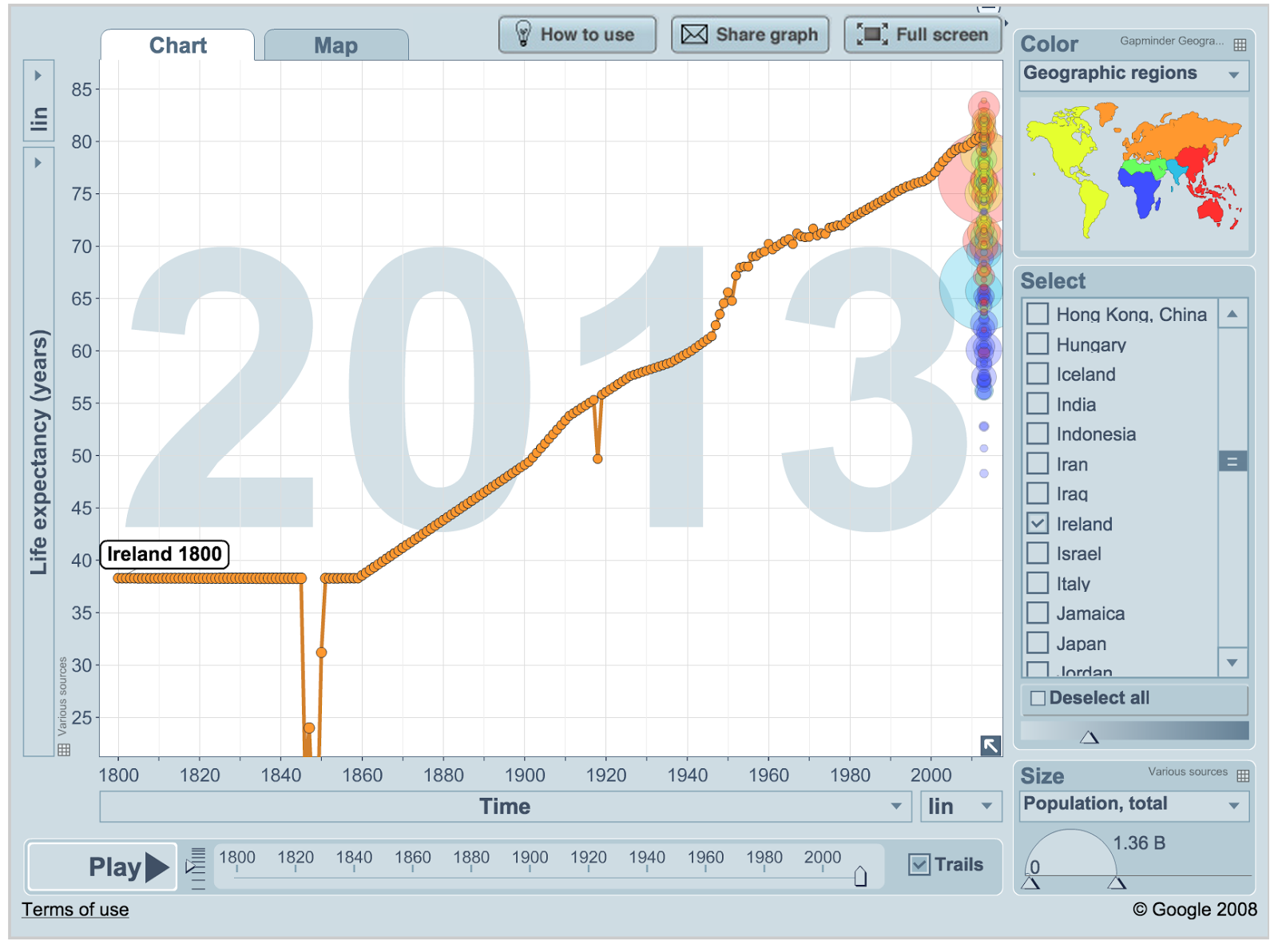
Gapminder uses a line graph to visualise life expectancy over time. I downloaded the life expectancy data from gapminder.


The interesting points here are the famine where the life expectancy dropped from an estimated 38.3 to 14.1. Also the 1918 flu epidemic causes an obvious drop from 55.3 in 1917 to 49.68 and back to 55.8 in 1919.
I use this data to create a graph using the code below. The idea is like tree rings except that instead of each line laid down in a particular year each line represents the life expectancy in that year.


The size of each ring should be a good representation on the number of years people could expect to live in that year. However I just multiplied the years given by Gapminder *6 to give the number of pixels each circles radius should be. A proper visualisation has to be more careful not to distort the number than this. Roughly, living twice as long should look like a tree that is twice as big.

The code to create this graph in a canvas element of a webpage if here. So what do you think, does this visualisation show increase in lifespan in the last 200 years well?

Saturday, February 28, 2015

What Colour are Books?

What colour are famous books?

Colours Used I counted up the occurrence of the
colours = ["red","orange","yellow","green","blue","purple","pink","brown","black","gray","white", "grey"]
in Ulysses by James Joyce. I'll post the word count code soon

red 113, orange 12, yellow 50, green 98, blue 82, purple 17, pink 21, brown 59, black 146, gray 2, white 163, grey 68

Turned this count into a barchart with r package ggplot2 graphing package

library(ggplot2)
df <- data.frame(colours = factor(c("pink","red","orange","yellow","green","blue","purple", "brown", "black", "white", "grey"), levels=c("pink","red","orange","yellow","green","blue","purple","brown", "black", "white", "grey")),
                 total_counts = c(21.0, 113.0,12.0, 50.0, 98.0, 82.0, 17.0, 59.0, 146.0,163.0,70.0))
colrs = factor(c("pink","red","orange","yellow","green","blue","purple", "brown", "black", "white", "grey"))

bp <- ggplot(data=df, aes(x=colours, y=total_counts)) + geom_bar(stat="identity",fill=colrs)+guides(fill=FALSE)
bp + theme(axis.title.x = element_blank(), axis.title.y = element_blank())+ ggtitle("Ulysses Color Counts")
bp 

There is a huge element of unweaving the rainbow in just counting the times a colour is mentioned in a book. The program distills “The sea, the snotgreen sea, the scrotumtightening sea.” into a single number. Still I think the ability to quickly look at the colour palette of a book is interesting.

The same picture made from the colours in Anna Karenina by Leo Tolstoy, Translated by Constance Garnett


Translations
Translations produce really funny graphs with this method. According to Jenks@GreekMythComix the ancient Greeks did not really use colours in the same abstract way we did. Things were not 'orange' so much as 'the colour of an orange'. The counts in the Alexander Pope translation of the Iliad are
red 36, yellow 11, green 16, blue 9, purple 43, brown 4, black 69, gray 1, white 25, grey 6

Because colours are not really mentioned in the original Iliad these sorts of graphs could be a quick way to compare translations. Google book trends does not seem to show increased use of these colours overtime.

Sunday, February 22, 2015

2014 Weather Visualizations

There is a great tutorial by Brad Boehmke here on how to build a visualization of temperature in one year compared to a dataset. The infographic is based on one by Tufte

Met Eireann have datasets going back to 1985 on their website here. Some basic data munging on the Met Eireann set for Dublin Airport and I followed the rstats code from the tutorial above to build the graphs below. Wexford would be more interesting for Sun and Kerry for Rain and Wind but those datasets would not download for me.

The first is a comparison of the temperature in 2014 compared to the same date in other years.

Next I looked at average wind speed

And finally the number of hours of sun

These visualizations doesn't look like 2014 was a particularly unusual year for Irish weather. With 30 years of past data if weather was random (which it isn't) at random around 12 days would break the high and low mark for most of these measures. Only the number of sunny days beat this metric. The data met.ie gives contains every day since 1985

maxtp: - Maximum Air Temperature (C)

mintp: - Minimum Air Temperature (C)

rain: - Precipitation Amount (mm)

wdsp: - Mean Wind Speed (knot)

hm: - Highest ten minute mean wind speed (knot)

ddhm: - Mean Wind Direction over 10 minutes at time of highest 10 minute mean (degree)

hg: - Highest Gust (knot)

sun: - Sunshine duration (hours)

dos: - Dept of Snow (cm)

g_rad - Global Radiation (j/cm sq.)

i: - Indicator

Gust might be an interesting one given the storms we had winter 2014. I put big versions of these pictures here, here and here.

Wednesday, February 18, 2015

When were Wodehouse's stories set?

They seem to be sometime before the first world war. But I have never figured out when Wodehouse's books take place. From Something New by P.G. Wodehouse "Whoever carries this job through gets one thousand pounds.” Ashe started. “One thousand pounds–five thousand dollars!” “Five thousand.” Looking at historical exchange rates at www.measuringworth.com the rate stayed close to 1901s $4.87 up until the book was published in 1915. Because exchange rates did not change much at the time they do not help work out when a book was set.

Monday, February 09, 2015

Ancient Death Counts from Poems

What killed you in an ancient battle? Could we look at ancient epics for clues as to what killed people in fights at the time?

Pinker's better Angels of our Nature talks about how archeologists look at bones to see evidence of violent injuries that lead to death. The book talks about examinations of ancient bones unearthed in peat bogs and on long-forgotten battlefields. This bone examination will not tell us about injuries to people that do not cut bones.

The epic poems include the Iliad, Beowulf and the TĂĄin. They were passed down from Bards who memorised them and travelled from place to place reciting them. Some recent research suggests that these epics may have some basis in history. The social network described for the characters usually resembles one real people would have. The social network between characters in Homer’s Odyssey is remarkably similar to real social networks today. That suggests the story is based, at least in part, on real events, say researchers. 'They discovered that while the networks associated with Beowulf and the Iliad had many of the properties of real social networks, the network associated with Tain was less realistic. That led them to conclude that the societies described in the Iliad and Beowulf are probably based on real ones, whereas the Tain appears more artificial.'

There is a site that examines and lists the deaths in the Iliad here. I extracted from there counts for each mentioned body part killed or wounded someone*.

head 21 
jaw 2 
cheek 1 
ear 1 
eye 1 
mouth 1 
nose 1 
skull 1  

neck 12 
throat 3  
  
collar 1 
chest 17 
shoulder 7 
collar bone 2 
nipple 1 
ribs 1 1 of these wound
 
arm 4 3 of these wound
hand 1 1 of these wound
  
back 11 
buttock 2 
  
gut 10 1 of these wound
stomach 5 
liver 3 
 
side 6 
  
thigh 2 1 of these wound
hip 1 
knee 1 
leg 1 
foot 1 1 of these wound
 
groin 2 
testicles 1

I totalled these by body region

Head  29
Neck  15
Upper Body 29
Arm  5
Back  13
Lower Body 18
Side  6
Leg  6
Groin  3 
Using Color brewer to pick out colours I made bins of 5
25-30 RGB 153,0,13
20-25 RGB 203,24,29
15-20 RGB 239,59,44
10-15 RGB 251,106,74
5-10  RGB 252,146,114
1-5   RGB 252,187,161
0     RGB 0,0,0
And I made this into this weird picture. I got the drawing from here. And the idea from Greek myth comix.

Any translation will have disagreements so the original source or as close as we can get to it should be used. Ian Johnson's is the basis for these counts.

Upper body counts for 73 of the deaths: arm, back, legs and lower body count for only 51. But gut, liver and stomach (and maybe buttock) do account for 18 deaths which seems like modern archeology could miss. For example many bog bodies seem to have been ritually killed which may have involved more beheading then the standard violent death.

It would be interesting to do a similar count with the other epic poems to see if liver injury is as common in them or whether that relates to Greek culture.

Anyway please comment what you think about this sort of quantitative analysis of stories that are meant to be entertainment. Can they tell us anything about the ancient world?

*Alcmaon's death I left out as no specific part is named.

Wednesday, February 04, 2015

Irish Alcohol Consumption in 2020

Drink blitz sees bottle of wine rise to €9 minimum 'Irish people still drink an annual 11.6 litres of pure alcohol per capita, 20pc lower than at the turn of the last decade. The aim is to bring down Ireland's consumption of alcohol to the OECD average of 9.1 litres in five years' time.'

What would Irish alcohol consumption be if current trends continue? Knowing this the effectiveness of new measures can be estimated.

The OECD figures are here. I put them in a .csv here.The WHO figures for alcohol consumption are here I loaded the data in R Package

datavar <- read.csv("OECDAlco.csv")

attach(datavar)

plot(Date,Value,

     main="Ireland Alcohol Consumption")
Which looks like this

Looking at that graph alcohol consumption rose from the first year we have data for 1960 until about 2000 and then started dropping. So if the trend since 2000 continued what would alcohol consumption be in 2020?

'Irish people still drink an annual 11.6 litres' I would like to see the source for this figure. We drank 11.6 litres in 2012 according to the OECD. I cannot find OECD figures for 2014. In 2004 we drank 13.6L the claimed 20pc reduction of this is 10.9L, not 11.6L. Whereas the 14.3L we drank in 2002 with a 20pc reduction would now be 11.4. This means it really looks to me like the Independent were measuring alcohol usage up to 2012.

Taking the data since 2000 until 2012.

newdata <- datavar[ which(datavar$Date > 1999), ]

detach(datavar)

attach(newdata)

plot(Date,Value,

     main="Ireland Alcohol Consumption")

cor(Date,Value)

The correlation between year and alcohol consumption since 2000 is [1] -0.9274126. It look like there is a close relationship between the year and the amount of alcohol consumed in that time. Picking 2000, near the peak of alcohol consumption, as the starting date for analysis is arguable. But 2002 was the start of this visible trend in reduced alcohol consumption.

Now I ran a linear regression to predict based on this data alcohol consumption in 2015 and 2020.

> linearModelVar <- lm(Value ~ Date, newdata)
> linearModelVar$coefficients[[2]]*2015+linearModelVar$coefficients[[1]]
[1] 10.42143
> linearModelVar$coefficients[[2]]*2020+linearModelVar$coefficients[[1]]
[1] 9.023077
> 
This means based on data from 2000-2012 we would expect people to drink 10.4 litres this year. Reducing to drinking 9 litres in 2020. So with current trends Irish alcohol consumption will be lower than 'the aim is to bring down Ireland's consumption of alcohol to the OECD average of 9.1 litres in five years'.

There could be something else that is going to alter the trend. One obvious one would be a glut of young adults. People in their 20 drink more than older people. If there are a higher proportion of youths about then the alcohol consumption will rise all else being equal. So will there be a higher proportion of people in their 20s in 5 years time?

The population pyramids projections for Ireland are here. Looking at these there seems to have been a higher proportion of young adults in 2010 than there will be in 2020 which would imply lower alcohol consumption

it would be interesting to see the data and the model that the prediction of Irish alcohol consumption are based on. And to see how minimum alcohol pricing changes the results of these models. But without seeing those models it looks like the Government strategy is promising current trends to continue in response to a new law.

Sunday, November 16, 2014

The number of new drugs is declining

Why Are So Few Blockbuster Drugs Invented Today?
since 1950, the number of new drugs approved has fallen by half roughly every nine years, meaning a total decline by a factor of 80. They called this Eroom’s Law, because it resembled an inversion of Moore’s Law

Graph from In the Pipeline (more here)

Why has the worm not been emulated?


"The way the prophets of the twentieth century went to work was this. They took something or other that was certainly going on in their time and then said that it would go on more and more until something extraordinary happend." G. K. Chesterton

What if you could emulate the brain the way we emulate computer worms?

C elegans is a 1mm long worm with 302 neurons, 3 Nobel prizes and has survived a space shuttle crash. It is one of the simplest animals and has been studied in massive detail. Like the fruitfly or ecoli anything these lab animals do that you cant explain you wont be able to explain in people either.

Whole brain emulation is a prediction that we will be able to simulate the brain in enough detail to create artificial intelligence very like us.

Robin Hanson on econtalk talked about the possible results of whole brain emulation.
"This scenario, which we've called whole brain emulation--taking a whole brain and emulating it on a computer--requires three technologies. One is scanning--you have to be able to scan something in sufficient detail; have to see exactly which parts are where and what they are made of. Two, you have to have models of these cells, a model of the cell input signature and then what comes out of it as a mapping--doesn't have to be exactly right, just has to be close enough. Three, you need a really big computer. A lot of cells, a lot of interactions."
Hanson blogs about brain emulation here. There are interesting fights about whether whole brain emulation is a reasonable prediction or just "the rapture for nerds".

Many biologists seem to think computer people are completely misunderstanding how complicated biological systems are and computer sciencey whole brain Emulation types say that biologists do not understand abstractions because they deal with this complexity all the time.
'[Robin] Hanson’s fundamental mistake is to treat the brain like a human-designed system we could conceivably reverse-engineer rather than a natural system we can only simulate. We may have relatively good models for the operation of nerves, but these models are simplifications, and therefore they will differ in subtle ways from the operation of actual nerves. And these subtle micro-level inaccuracies will snowball into large-scale errors when we try to simulate an entire brain, in precisely the same way that small micro-level imperfections in weather models accumulate to make accurate long-range forecasting inaccurate.' is an example of the biologists argument against brain emulation.

'We should expect brain emulation to be feasible because brains function to process signals, and the decoupling of signal dimensions from other system dimensions is central to achieving the function of a signal processor.

"We can do trend extrapolation and say: Where are we now; if trends continue how long would it take? The computing technology has a nice solid trend; we can project that pretty confidently into the future. The problem is we don't really know how detailed we're going to need to go into these cells. The scanning technology, we have decent trends. This is a vastly smaller industry; small demand. That technology actually looks likely to be ready first. We've actually done a scanning of a whole mouse brain at a decent resolution. A thousandth smaller than a human brain. What does that mean--scanning of a brain? They slice a layer, do a two-dimensional scan of that layer at a fine resolution, go across each cell, and then they slice another layer and do the same thing again. Let me ask again, sort of naive question: If you could take a person's brain out of their head while they were still alive, are you going to be able to get access to my memories in this process? my creativity? All these things we think of as more than a physical process, but of course as you say, it's just chemicals interacting. Is it imaginable that we would be able to reconstruct my memories? To the extent we are confident that your memories and personality are encoded in these cells and where they are and how they talk to each other, so we get that right, we get it all right. That's all you are. Let me say it differently. Looking at it isn't enough. Scanning means noticing the chemical densities. There's thousands of kinds of cells in your brain, and each cell sort of behaves a bit differently. What we need is to know when a cell gets a signal from the outside, electrical or chemical signal, how does that change a cell and what kind of signal does it send out. So, we need to have a model of each of those cell types. We have, actually, models of a wide range of cell types. Doesn't seem that hard to model these cells. We just have a lot of cells to go through and not that much motivation to do it all in a rush. We have actually pretty good models of some particular cells. We have a cell on a dish, we send a signal in, model on the computer, do the same things."

Both sides here. The brain is really complicated squishy stuff and the simcity looks like a real city if you squint sides here could be right. I want a comparison of the predictions of these two theories now and not in 2040 though.

If we had Hanson's 1,2,3 met for an organism and we were not emulating it that would seem to be a problem for the theory.

One is scanning--you have to be able to scan something in sufficient detail;

The c elegans connectome was mapped in 1986
Two, you have to have models of these cells, a model of the cell input signature and then what comes out of it as a mapping--doesn't have to be exactly right, just has to be close enough. There are not many types of neurons in c elegans so we should have a fairly good model of when they will fire.


Three, you need a really big computer. A lot of cells, a lot of interactions."
How big a computer would you need to model all these cells and interactions?

In When will computer hardware match the human brain?
Hans Moravec (1997) gives some nice graphs of how much processing you get for $1000


Kurzweil gives similar figures here

This puts the amount of processing available to a C. elegans at about 1990 levels for $1000. So in 1986 that processing power would have easily been available to university researchers. Maybe that graph is optimistic but if it is out by 25 years for something as simple as c elegans that means predictions of whole brain emulation by 2050 also on the graph will be out as well.

For the last 25 years we have had the power to emulate the whole brain of C. Elegans. Why haven't we?

1. We have not actually because our neuron firing models has not been accurate enough
2. No one cares about emulation fo a worm. A lot of people care about this worm the numbers of neuroscience papers on it confirm this.
3. They are just a bit delayed. There is a thread here on less wrong about this
an open source project openworm*
4. It is hard to get output from a worm 'Our first goal is to combine the neuronal model with this physical model in order to go beyond the biophysical realism that has already been done in previous studies. The physical model will then serve as the "read out" to make sure that the neurons are doing appropriate things.' Pixar, special effects companies and computer game programmers must have fairly good worm emulation programs. If there is a big problem making an animal bodies simulation surely one of them could easily enough make a good model of a tiny bag of gunk?

'Whole Brain Emulation A Roadmap' acknowledges the gap that exists in our emulation of the animal and suggests alternatives ' While the C. elegans nervous system has been completely mapped (White, Southgate et al., 1986), we still lack detailed
electrophysiology, likely because of the difficulty of investigating the small neurons. Animals
with larger neurons may prove less restrictive for functional and scanning investigation but
may lack sizable research communities'

Why 25 years after having a good map and enough computation to run the calculation have we not emulated C Elegans? If it is the modelling of the cells
'I have talked several times to one of the chief scientists who collected the original connectome data and has been continuing to collect more electron micrographs (David Hall, in charge of www.wormatlas.org). He has said that the physiological data on neuron and synapse function in C. elegans is really limited and suggests that no one spend time simulating the worm using the existing datasets because of this. I.e. we may know the connectivity but we don't know even the sign of many synapses.'

The openworm project is really cool. and it might be a good way to get some evidence into the whole brain emulation debate now.

'The problem is we don't really know how detailed we're going to need to go into these cells. '

If Ken Hayworth is right and it is just that 'He has said that the physiological data on neuron and synapse function in C. elegans is really limited' is this because the biologists are right and step 2 the cell models will not be as easy to build as supporters of whole brain emulation claim?
These is a project here to emulate C Elegans. And a good paper here on the problem involved Dynamics of the model of the C Elegans neural network. Just in time to make me look more stupid is A Worm's Mind In A Lego Body. It is not full emulation yet but it is at lest on the path there. * An article from Popular Science on Whole Brain Emulation here that made me resurrect this post I drafted two years ago. Since then the openworm project has moved on massively.

Drones and Ecology

Drones have become wildly popular recently. They seem to be on the path of military, geeks, specific industries ->everything that successful tech seems to go through. It seems likely that large numbers of small deliveries will take place by drone in ten years time. One thing that damaged bird sized tech in the past was hawks. Jon Bentley described in 'More Programming Pearls'
The computers at the two facilities were linked by microwave, but printing the drawings at the test base would have required a printer that was very expensive at the time. The team therefore drew the pictures at the main plant, photographed them, and sent 35mm film to the test station by carrier pigeon, where it was enlarged and printed photographically. The pigeon's 45-minute flight took half the time of the car, and cost only a few dollars per day. During the 16 months of the project the pigeons transmitted several hundred rolls of film, and only two were lost (hawks inhabit the area; no classified data was carried). Because of the low price of modern printers, a current solution to the problem would probably use the microwave link.
Hawks have a habit of attacking small things we send through the skies. There is this great piece on the effect of Amazon drones on ecology. The Dark Extropian Report: The Evolution of Amazon’s “Prime Air” Drone Delivery Service
Hawks and other birds of prey taking issue with these noisy (for now) airborne intruders into their territory. Everyone was worried about people below shooting them down, but it turns out there may be another threat that can’t be so easily policed; outlaw avians....A delivery drone that takes its shape and forms that outline in the sky will not be attacked by a lesser predator, even if it’s not already wired into their genetic memory

The article suggests creating drones that look like very big hawks to discourage natural hawks from attacking them.

This effect doe not just apply to birds of prey though. Prey species hide when they see the outline of a bird of prey. And doing this increases their anxiety enough to reduce feeding and decrease numbers drastically over time. The drones that look like birds of prey will not have to prey. Just being in the sky with the right silhouette will drastically reduce the number of vermin.

According to this article

Changes to ecology have unpredictable effect on the environment. Less pigeons would seem an improvement to the urban environment but they do eat bread and other foodstuffs. If numbers are reduced enough to prevent this bad things could happen.

tldr: 1. there will be lots of drones 2. They will look like birds of prey 3. They will have a big effect on rats, pigeons and other prey species.

Sunday, November 02, 2014

Water Protest Maps

Liam Hogan and Joan Byrne made a great google map here of the water protests in Ireland on November 1st. They kindly let me use their data to create some graphs.

The code and data is here. I will update is as data improves. And maybe to improve the labels on the graphs.

First the number of protestors per county

Number of protestors as a percentage of population of each county

An interesting way of looking at this would be in terms of blocks of 27,640 people. this is the average number of people per TD in Ireland

Dublin has the most variation on the number of protestors. The number in the main O'Connell Street protest was the largest and the one with the most variation in estimated numbers. Other than this most people seem to agree with the numbers Liam and Joan have on their map.

Thursday, October 30, 2014

Apple were never about home computers

According to Wikipedia Steve Jobs' first TV interview was in 1980 in Ireland with Pat Kenny. He talks about the apple being sent up on the space shuttle.

Pat:'Do you actually believe that every home, in the short term at least, will have a personal computer?'

Steve:'We base our theory on the fact that we make personal computers that can be used irrespective of location. The home just happens to be one of the locations apples can be used in'

This shows a fair amount of ambition given it was 4 years before the Macintosh was released.

Friday, August 22, 2014

Making Ebooks More Physical

For this invention will produce forgetfulness in the minds of those who learn to use it, because they will not practice their memory. Their trust in writing, produced by external characters which are no part of themselves
Socrates to Plato in Phaedrus
"A new study which found that readers using a Kindle were "significantly" worse than paperback readers at recalling when events occurred in a mystery story is part of major new Europe-wide research looking at the impact of digitisation on the reading experience." ... "The Kindle readers performed significantly worse on the plot reconstruction measure, ie, when they were asked to place 14 events in the correct order."

The researchers suggest that "the haptic and tactile feedback of a Kindle does not provide the same support for mental reconstruction of a story as a print pocket book does".

"When you read on paper you can sense with your fingers a pile of pages on the left growing, and shrinking on the right," said Mangen. "You have the tactile sense of progress, in addition to the visual ... [The differences for Kindle readers] might have something to do with the fact that the fixity of a text on paper, and this very gradual unfolding of paper as you progress through a story, is some kind of sensory offload, supporting the visual sense of progress when you're reading. Perhaps this somehow aids the reader, providing more fixity and solidity to the reader's sense of unfolding and progress of the text, and hence the story."

From the Guardian If haptic and tactile feedback to give a sense of progress in a book is so important how could this be added to ebook readers? One possibility is a weight that moves from one side of the ebook reader to another as you progress. This would mirror the feeling of a book starting heavier on the right and ending heavier on the left. Assuming you are reading English and not Manga or other back to front based moving system. This could be accomplished with by moving a marble as the book progresses.

Another option is to change the weight based on how far through the book you are. By adding Pez dispenser to the back of the ebook reader that dispensed sweets at points during the book a physical change in the book would result.

Once you are doling out sweets anyway you could flavour them based on the book in question. That would mean you could supply a flavour for the text at certain points which would provide the sort of physical feedback books currently do not. What flavours would go with which books and where? I have never been able to get access to the kindle SDK. But this seems like the sort of hardware project you could try at a hack weekend if you had access to the kindle api.

Thursday, June 26, 2014

The Great Stagnation, Football Ball Edition

'Since 2002, panel numbers have roughly halved every four years: 32 in 2002, 14 in 2006 and eight in 2010. Thus, by the 2022 World Cup, players should be kicking a single-panel ball around the pitch.' claimed Ken Bray here. I will call this Brays law 'The number of panels on the World Cup football ball will half every tournament'. This is not quite as epoch defining as Moore's law but still cool I think.

This year according to projections the soccer ball in the world cup should have at most 4 panels. Instead the ball has 6. 50% more panels then you would expect if progress continued at the rate Bray predicted. The Great Stagnation is the belief that things are not improving as quickly as they used to and is used to explain why we still have homeless people but not flying cars.

The number of panels each world cup ball has is found on each balls individual Wikipedia page.

2014 the Adidas Brazuca: 'The ball has been made of six polyurethane panels'

2010 the Adidas Jabulani: 'The ball was constructed consisting of eight (down from 14 in the 2006 World Cup) thermally bonded, three-dimensional panels'

2006 the Adidas Teamgeist:'The Teamgeist ball differs from previous balls in having just 14 curved panels rather than the 32 that have been standard since 1970. Like the 32 panel Roteiro which preceded it'

Fewer panels mean the ball is smoother and should fly more true. The ball flying true involves the interaction of several variables other than the panel number though. The 2010 ball was notorious for wobbly flight for example. For this reason just reducing the number of panels at the expense of the quality of the ball is a bad idea and may explain why Bray's law has failed. Still not being able to make a ball work with fewer panels indicates a technological innovation slow down to me. The aerodynamics of soccer balls and why there is a race to fewer panels is described in Brays article 'A fly walks round a football'.