Tuesday, March 31, 2020

Give everyone LCT strips

The idea previously of LCT bracelets won't work. Arm temperatures are just not accurate enough to show fever. In some cases when you get a fever your lower limbs actually gets colder.

But that does not mean these cheap thermometers are of no benefit. There is an interesting model here from Paul Romer about how even an inaccurate test can reduce spread. Here is his simulation for a test with a 20% and 40% false negative rate results in large reductions in the spike int he number of infections.


and with 40% False Negative Rate

One such test might be the thermometer test for fever it is cheap but not very accurate. About 30% of people might not have fevers in spite of having covid-19.  It seems to be unknown how infections these asymptomatic people are.
Another paper on Wuhan says "Per person, these undocumented infections were half (52 percent) as contagious as documented infections yet were the source of two-thirds of documented infections" but undocumented does not mean asymptomatic.

There is also this interesting article on the issues with temperature checking in Asia. ‘Thermometer Guns’ on Coronavirus Front Lines Are ‘Notoriously Not Accurate’ it seems outdoor ones are pretty useless. And they need to be aimed very carefully.

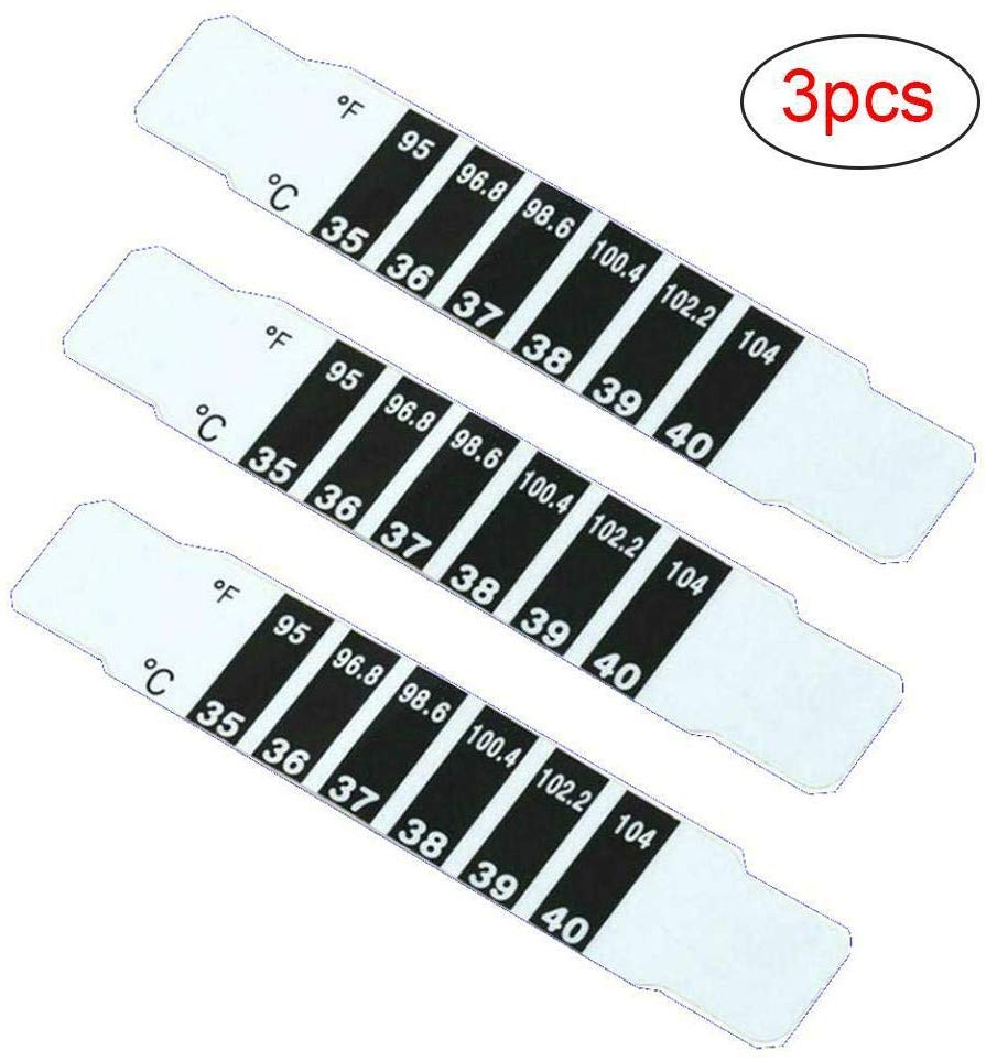
All these bits of evidence combined seem to suggest that encouraging and facilitating everyone to check their temperature everyday at home might be worthwhile. LCT strips in particular are still available and are really cheap

Here is a supplier that can provide a million reusable LCT a month at a price of 3.6 cent each. There are 1.7 million dwellings in Ireland. Buying one for every dwelling in Ireland would cost 62,500 euro. 138.45 million housing units in the United States = 6 million dollars

Supplying these to households as a cheap if not very accurate test could well meet a cost benefit analysis.


Wednesday, March 18, 2020

Automatic Temperature Scanning 2

Here is a design to find fever in streams of people entering a workplace, school or public building


This can be done by hand but I want to make it cheaper

Ultrasonic detector tells someone is in front of it. (MLX90614)
Gets them to the right distance with a display (not shown)
Mirrored picture in an antiviral metal helps the person line themselves up in front of the IR sensor.
Flashes red if they are above 37.5C


Saturday, March 14, 2020

Temperature Measuring Bracelet


If it is a good idea to check peoples temperatures a lot there are probably three distances you want to check them at
1. Personal level
2. Places lots of people go through like employee bathrooms
3. Public places like airports.

Each of these has different requirements.
For Personal thermometers the idea is you have a temperature sensor showing you do not currently have a fever. And if you do that is rapidly detected to reduce the number of people you infect. 

Personal thermometers they need to be really cheap. Not need much power. And be socially fashionable to show off.
Liquid crystal thermometer fits most of these requirements. These were suggested by Tara Whelan


Can they be made durable enough and fashionable enough to get people to wear them?


Edit: the physiology of the arm means these won't work as bracelets.


Friday, March 13, 2020

Automatic Temperature Scanning

I blogged last night about how automatic temperature reading of people several times a day might reduce the number of infectious people out in public
Temperature Scanners Everywhere  Is that post if you want to see the reasoning. 

How about we put a remote thermometer and displays on bathroom mirrors?

What would happen if you 
1. Attached Infrared thermometers (slightly reassembled) to the mirror
2. Put a switch on it that turned it on when someone stood in front of the mirror
3. Output the reading to a display on the mirror

There are several instructable here on how to make the handheld type of forehead thermometer at a distance https://www.instructables.com/id/Arduino-Laser-Infrared-Thermometer/ this is much the same mechanism but in a different container.

All these parts combined and mass produced would probably cost around 10 Euro. Private and Employee bathrooms might be best for privacy reasons. There is no network connection or face recognition involved here just a very simple temperature reading.


Thursday, March 12, 2020

Temperature Scanners Everywhere

'Why did Singapore’s containment strategy work, in such a high-density location?  Their program is mostly symptom/temperature checking-based'

It does seem like having symptoms really ups how infectious you are
"while we are learning that there are people who can shed COVID-19 virus 24-48 hours prior to symptom onset, at present, this does not appear to be a major driver of transmission. " WHO

'Some spread might be possible before people show symptoms; there have been reports of this occurring with this new coronavirus, but this is not thought to be the main way the virus spreads. ' CDC

Singapore is doing twice a day checks for some people
'All employers should require their employees to check their temperature at least twice daily, check for respiratory symptoms, and for those unwell to visit a doctor immediately.' During SARS they did something similar 'Singapore became the so-called country of thermometers: temperature monitoring was made mandatory in schools and temperature screening was instituted at entry to public buildings.'

In China 'In every business I enter (whether that’s a restaurant, supermarket, or retailer), someone takes my temperature and asks me to write down my phone number. Taikooli, the large outdoor mall by where I live, has blocked off most entrances to corral people into temperature check zones'

Airport screening does not work as it only catches you if you are sick at just the right moment so the checks have to be regular.

 What is the most efficient way to get peoples temperatures checked twice a day? Non-Contact Infrared Thermometer are cheap ($10). Paying people to hold them is expensive. Grabbing a thermometer others have grabbed sounds unhygienic. And trusting people to measure themselves expects a lot from them. But a thermometer held on a stand that checked people, that's cheap. Some logging would probably be necessary but lets work out the basic concept first.

Would twice daily temperature checks reduce R0? The idea is to reduce the period of time someone with symptoms is not isolated.
If so is there a way to set up a machine to check your temperature so they do not have to be manual?

Monday, March 09, 2020

Corona Virus and the Wheat on Chessboard problem

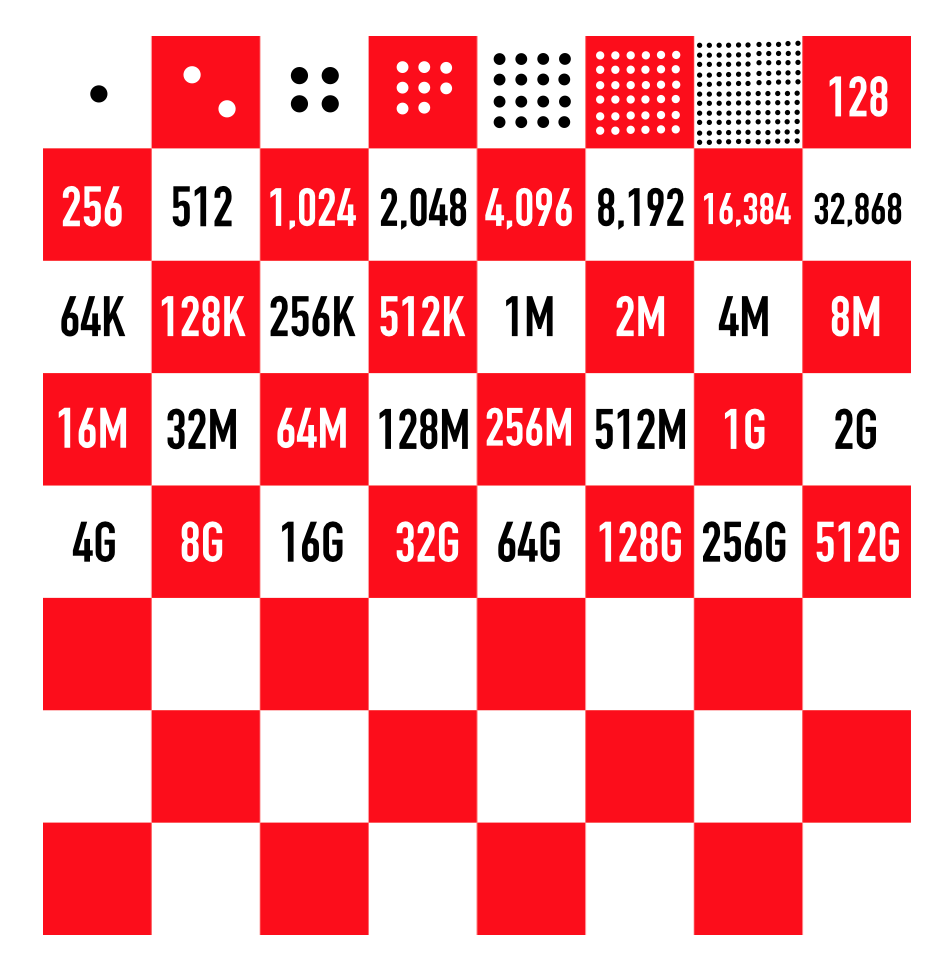
Exponential growth is really counter intuitive. But think of a chessboard where on the first square you have one grain of wheat. And every square you double the amount of wheat


Entire World Population number of wheat is square 34.
UK and Italy population are each square 27
US is Square 29
Ireland is square 24

Cases of Coronavirus currently UK, US and Ireland are about 18 squares behind the entire population number. Italy about 13 squares behind. Or 5 ahead of us. We at the moment move onto a new square every 4 days according to here. So Italy now is Ireland, UK or US in three weeks time at that really fast growth rate. Infection rates are not exactly exponential, eventually they start running out of new people to infect. But thinking about doubling is a useful shorthand to see how things can get scary fast.

I work with colleagues in China. The region they are in Liaoning has 43 million people. This would be Square 26.5. Liaoning, Mainland China
Confirmed: 125 Deaths: 1 Recovered: 110 Active: 14 These 125 cases puts them on square 8. They are at the same ratio as we are 18 doublings behind everyone being infected.
They wear mask all the time outside and in the office. Each person is only allowed to go to office one day in 3. All schools are closed.
They are at the same point as Ireland, UK and US and are on lockdown compared to here. Increasing this time to move to the next square like China and Singapore have done is really important

Friday, February 28, 2020

Drone Food Delivery

Manna sat they are going to deliver food March 2020 in UCD. 'Drone delivery company Manna plans to pilot its takeaway food delivery service on the campus of University College Dublin from the end of March.' Which will be great if it happens.

I can't find any videos of someone making an order and getting it delivered. Or anything close to a test run of that. Including from students seeing a delivery test and recording that.


All there is is slick PR video that is not a real delivery


I've asked some people involved if they had done test runs in UCD and I was told they did test runs in 'Last 3 years in wales and here. Tens of thousands of flights. UCD Just another step in the process.' 


Physical startups are hard. Airbnb and Uber took existing hardware, a mobile app and lots of negotiations with a regulator to create businesses worth billions. Manna seem to be negotiating with the regulator 'Irish Aviation Authority questions new Dublin food drone delivery service'. They could use the delivery company app or a version of that that let you indicate you were in UCD and what drop point you wanted to use. Getting that to only to all UCD students would be tricky but not impossible. If it not all students but only a few then it is a demo not a pilot. The drone they are using is well known so that is existing hardware. Both AirBnb and Uber did lots of physical testing of their product in the early phases and doing this with drones is really visible.

I could be wrong to be suspicious that this is going to be a demo not a full pilot for lots of people over an extended period. If I am wrong I will admit that next month. It will be cool if they can get this delivery pilot working then.


Friday, February 21, 2020

Ireland should make the Flu Vaccine Free for All

Ireland should make the Flu vaccine free for all people this year.

Firstly it is cost effective in general.
SYSTEMATIC REVIEW OF THE COST-EFFECTIVENESS OFINFLUENZA IMMUNIZATION PROGRAMS:A CANADIAN PERSPECTIVE
Runs the numbers for Canada and it is cost effective to freely vaccinate everyone
'Generally, from the societal and healthcare system perspective, vaccination was cost-effective. For pregnant and post-partum women, vaccinating all versus only high risk was cost-effective. For children (6 months to18 years), vaccinating all versus only high risk was cost effective, especially for infants, toddlers, and adolescents. For healthy working age adults (19 to 64 years), results were mixed, and sensitive to vaccine efficacy, uptake, and productivity loss. For adults with co-morbidities and healthcare workers, vaccination was cost-effective.'

Think of it this way a vaccination in Ireland costs 20 euro. About 10% of Irish people get the flu every year. Would you pay 200 euro not to get the flu? In lost earnings alone it is probably worth that.

Secondly Ireland has an overcrowding crises in its hospitals.
HSE apologises to those affected by overcrowded emergency departments as some hospitals ban visitors
It said the flu season arrived up to four weeks earlier than last year and has lead to a  “significant surge in patient demand”.

Flu and bed shortage responsible for record trolley numbers, says Taoiseach

Free flu shots will not prevent this overcrowding but it will reduce it. The evidence from Canada is based on a cost benefit analysis that does not include the costs of treating people as badly as we do in overcrowded hospitals. Which makes vaccinations more cost effective here. Vaccination would not be a long term solution to all the overcrowding problems but it would reduce overcrowding somewhat this year.

Lastly there is a non trivial chance that the COVID19 virus will lead to a surge of sick people in Ireland As such it is vital we have as much spare capacity in the medical system as possible. Free flu vaccination is one quick way to add that capacity by reducing demand.

Many in Ireland are already entitled to free vaccination. Roughly 1 million of the 4.8 million of us. 650,000 of us are over 65 for example and people with certain health complications or jobs are also entitled to free flu vaccination. At 20 euro each the remaining 3.8 million of us would cost an extra 76 million euro. Which in health spend is low.

Because flu vaccines are cost effective, especially once loss of earnings are taken into account. Because our medical services are overstretched. And especially because of the risk of COVID19. Ireland should order extra flu vaccinations this year and offer them to everyone for free.

Wednesday, October 16, 2019

The Best Star Trek Episodes are Quantum Leap Style Ones

Star Trek in particularly the first two series was monster of the week sort of stuff. The best episodes tend not to follow the beam down get in trouble get out of it template. But I think the best follow the 'living someone else's life' Quantum Leap template

Looking at the top 20 rated episodes from imdb https://www.imdb.com/list/ls076657706/

20. Star Trek: Voyager (1995–2001)
Episode: Scorpion (1997)

19. Star Trek: Voyager (1995–2001)
Episode: Blink of an Eye (2000)

18. Star Trek: The Next Generation (1987–1994)
Episode: Tapestry (1993) -QL

17. Star Trek: Deep Space Nine (1993–1999)
Episode: Call to Arms (1997)

16. Star Trek: The Original Series (1966–1969)
Episode: Space Seed (1967)

15. Star Trek: The Original Series (1966–1969)
Episode: The Trouble with Tribbles (1967)

14. Star Trek: The Next Generation (1987–1994)
Episode: Cause and Effect (1992) -QL

13. Star Trek: The Original Series (1966–1969)
Episode: Balance of Terror (1966)

12. Star Trek: The Next Generation (1987–1994)
Episode: Q Who (1989)

11. Star Trek: Deep Space Nine (1993–1999)
Episode: Duet (1993)

10. Star Trek: The Next Generation (1987–1994)
Episode: The Measure of a Man (1989)

9. Star Trek: Deep Space Nine (1993–1999)
Episode: The Visitor (1995) -QL

8. Star Trek: The Next Generation (1987–1994)
Episode: Yesterday's Enterprise (1990) -QL

7. Star Trek: The Original Series (1966–1969)
Episode: Mirror, Mirror (1967) -QL

6. Star Trek: Deep Space Nine (1993–1999)
Episode: In the Pale Moonlight (1998)

5. Star Trek: The Next Generation (1987–1994)
Episode: The Best of Both Worlds: Part II (1990)

4. Star Trek: Deep Space Nine (1993–1999)
Episode: Trials and Tribble-ations (1996) -QL

3. Star Trek: The Next Generation (1987–1994)
Episode: The Best of Both Worlds (1990)

2. Star Trek: The Original Series (1966–1969)
Episode: The City on the Edge of Forever (1967) -QL

1. Star Trek: The Next Generation (1987–1994)
Episode: The Inner Light (1992) -QL

8 of the top 20 marked here with -QL and 6 of the top 10 involve someone else's life or a parallel universe.

Thursday, September 05, 2019

Climate and NFL graphs


I worked out how to combine graphs into one picture in r package this week. This image of Englands weather since 1878 got 7 thousand upvotes on reddit.


And three months together in a way that allows tighter y axis


For the animation below the code is at https://gist.github.com/cavedave/5f6d61ed5b6eef0ea74a713ce3b33c94

This type of graph I found out about here. This is not a particularly interesting graph but I think the animation of 2+ classes of things changing over two dimensions over time is interesting.


Saturday, August 17, 2019

England's Summer Weather

England has some of the oldest weather recordings in the world. This means that when people say things like '1976 summer had X days hot in a row and so climate change isn't real' you can look at a lot of data and see what the overall trends are.

One dataset back to 1878 is the hottest each day got. This is the 'temperatures up to' figure weather forecasts give.
You can see 1976 was hot but also the trend over time. 1976 was very unusual for the 100 previous years. And now it looks fairly normal.

The English dataset goes back to 1659 for average daily temperatures. Here is how those temperatures have changed for June, July, August over that time.


June,July, August Central England average temperature since 1659
total dataset Mean: 15.3
1652-1700: 14.9
1701-1725: 15.2
1725-1750: 15.6
1751-1775: 15.3
1776-1800: 15.6
1801-1825: 15.1
1826-1850: 15.3
1851-1875: 15.3
1876-1900: 15.1
1901-1925: 14.9
1926-1950: 15.6
1951-1975: 15.3
1976-1994: 15:5
1994-2019: 16.0


Wednesday, August 14, 2019

Weather Overflows

Twice recently I have seen weather so unusual that the software designed to show weather failed.

The first was Hurricane Orphelia that went outside the range hurricanes are expected in. It went further north than the software was able to map


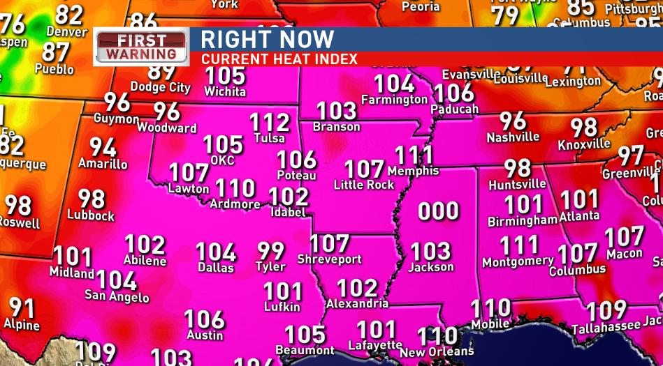
The second was this week where Mississippi got so hot (121F) that the temperature map could not show it and flipped over to 000.


Friday, March 22, 2019

Ireland Population Density Maps

Data from https://ec.europa.eu/eurostat/web/gisco/geodata/reference-data/population-distribution-demography/geostat which has population grid at a 1km2 population sizings for all of Europe in 2011. The code is very slightly modified version of the code developed by halhen and p0bs here https://gist.github.com/halhen/659780120accd82e043986c8b57deae0


Color Maps


Joyplots
Where population density is seen as an increase in height.


Other Countries


Wednesday, March 20, 2019

Heatmap of the world

On the 14th of June 2016 I made a heatmap of global temperatures since 1850. This got popular on reddit with 15.4K points


The picture as I said in the first comment on the post was inspired by Ed Hawkins spiral animation of world temperatures and was an attempt to show everything in one picture.
A few outlets picked up the picture. The weather channel put it on facebook without crediting me.


Tableau I found out last year use it to advertise themselves but with no credit to me the original design


Ed Hawkins tweeted about the graph


And in June 2016 we discussed further as I switched Time to the Y axis and made other changes. My point is he tweeted about "'heat-map' representation of global temperature changes since 1850" two years before he published his heat map representation (using stripes). My graphs used the Hadcrut-4 and HadCET datasets


In May 2018 he produced a climate graph (below) with only years not months in the heatmap. At no point has he said that my heatmaps (which were inspired by his global temperatures spiral animation) might have inspired him.


I had produced a heatmap graph with lines for years that he saw in Sept 2017


Hawkins graph has deservidely become famous. And heatmaps are one of the most common visualisation types, which is evidence he could have come up with it on his own anyway. I would like if my ones did inspire him that it got mentioned somewhere. But the big deal here is that global warming is being shown in a popular eye catching way.


Monday, February 25, 2019

February is Hot

At the moment it is really hot. 20°C is ridiculously hot for this time of year.

Central England has weather data going back a long time. 1772 for daily average temperature and 1878 for maximum and minimum temperatures on each day.

2 times February the 25th since 1772 had an average temperature for the day above 10°C in Central England 1790 with 10.7°C, and 1922 with 11°C

The maximum temperatures observed in central England on the 25th of February were 1922 with 14.1,1953 with 13.1 and 1976 with 13.1 For those 140 years the maximum daily temperature averaged 6.6C.

I put the code to work all this out here. Graph of Feb 25th max temperature shows how weird 20°C is

It takes a while for the HADCET data to be updated. There is a nearby weatherstation http://www.weathercast.co.uk/world-weather/weather-stations/obsid/99060.html when I figure out the relationship between the two it will be possible to do a comparison between today and all the previous years.

Tuesday, February 05, 2019

English soccer is not normal

Are wins in football normally distributed? If they are not it might affect how we should calculate the probabilities of teams winning.

Baseball wins seem not to follow a normal distribution

There is a great R Package dataset of football results by James Curley here. This engsoccerdata has a function to generate soccer league tables of many countries over a long time period.

       league<-maketable_all(df=england[,])


team GP W D L gf ga gd Pts Pos

1 Manchester United 962 604 209 149 1856 847 1009 2021 1

and create a new column for the percentage of wins

       league<-league %>% 
    mutate(PercentW = W / GP)

p<-ggplot(data=league, aes(league$PercentW)) + geom_histogram()
#binwidth=20
p<-p + ggtitle("Percentage wins\n in English football league") +   xlab("Percentage Wins") + ylab("Number of Teams")
p<-p+theme_update(plot.title = element_text(hjust = 0.5))
p<-p + theme_bw()


       library(fitdistrplus)
library(logspline)
x<-league$PercentW
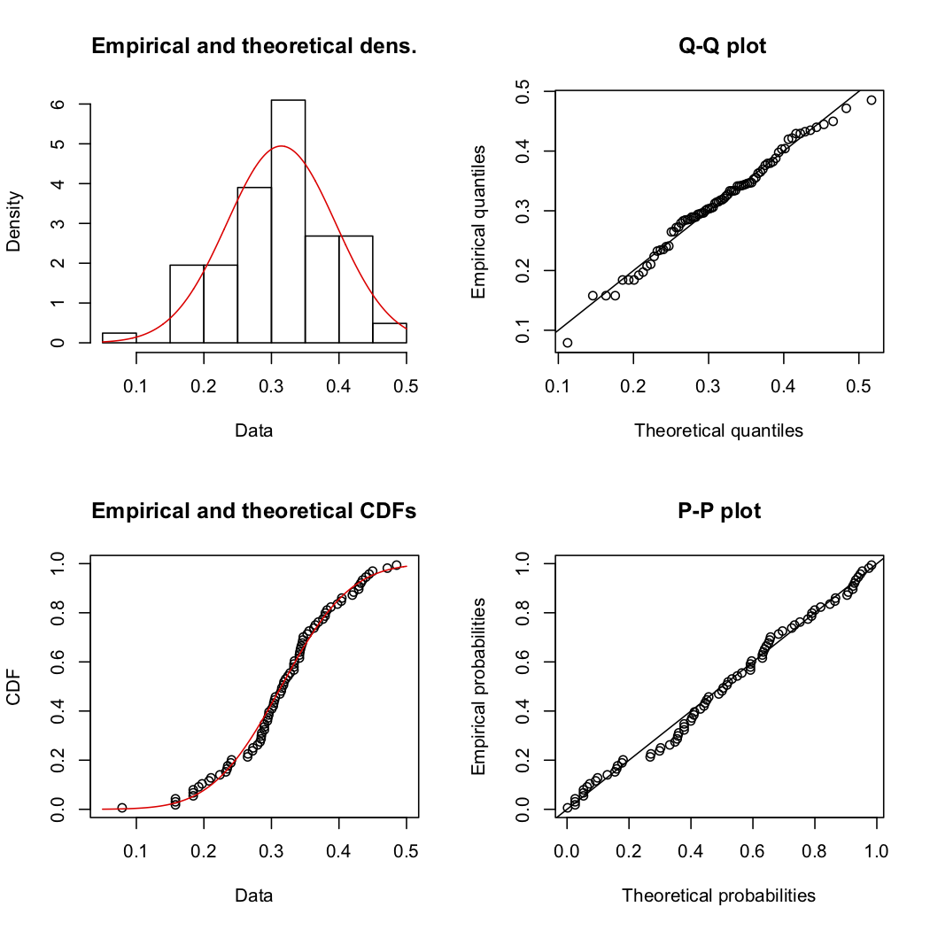
fit.norm <- fitdist(x, "norm")
plot(fit.norm)


       shapiro.test(x)       
 
Shapiro-Wilk normality test

data: x W = 0.96276, p-value = 0.0006663 Which means English football wins really do not have a normal distribution.

Goals per game are also not normally distributed. But I dont think anyone expectes them to be

       
league<-league %>% 
    mutate(GoalsPgame = gf / GP)
shapiro.test(league$GoalsPgame)


Shapiro-Wilk normality test data: x W = 0.92134, p-value = 4.818e-07

And for France

Shapiro-Wilk normality test

data: leagueF$PercentW W = 0.98522, p-value = 0.4699 so French football wins do not have might have (thanks for Paulfor the correction in the comments) a normal distribution. I must check the other leagues in the dataset as behaviour this different is odd.

Thursday, January 10, 2019

The Oldest Irishman Joke

John Scotus Eriugena (c. 815 – c. 877) was on the five punt note. And won a Michael D Higgins look alike competition in 870AD.

The French king sat opposite him and asked.

'Quid distat inter sottum et Scottum?' (What separates a sot [drunkard] from an Irishman?),

Eriugena replied, 'Tabula tantum' (Only a Table).

I think the gag setup still works 1200 years later.

What separates man from the animals?

The Liffey

Sunday, January 06, 2019

Ireland Carbon reduction by 2030

How are we going to meet Ireland's carbon reduction aims in the next eleven years?

How much do we need to reduce Carbon by?

We have committed to 'reducing greenhouse gas emissions by 40 per cent (compared to 1990 levels)'. Which is 60% of 56 million tonnes our carbon output by 40%. Which is 33.6 million tonnes of around 42.5% of our current carbon usage.

How would we do this?

On a personal level not an industrial one what would I have to do to reduce my carbon output by 40%? Please correct me if I am wrong here but roughly it seems to be

1. Get rid of my car. (as seen in Show Table: 2.5) 20% of our carbon output is Transport. Electric cars do not seem to be vastly more efficient than petrol ones.

2. Become Vegan. This seems to reduce food Carbon by about 40% .

3. Insulate the house and install energy efficient appliances. This seems to make less impact than cars and meat.

4. Sign up to airtricity. This one is easy enough.

How would this happen?

This all seems asking a lot. On transport Public transport subsidies would have to increase massively immediately. Even then 30% of Irish people live in the countryside which is really hard to do without a car.

It could be that rewilding the countryside means that we do not need to reduce carbon outputs by as much. But that would be a huge undertaking by itself.

Why is all this not being talked about? If I am totally wrong here please explain in the comments how to reduce by 40% in an easier way. If it is that we have to go vegan, live in cities and massively boost public transport starting immediately that seems to be a massive task.

Friday, January 26, 2018

Trumps Year 1

I posted here a year ago four things that if Trump improved he'd be keeping major campaign promises. Measures for a successful Trump

1. Better healthcare. Cover Everybody, cost less and have lower deducables - No things got Worse. America's uninsured rate is on the rise.

2. "If Trump can deliver an average of more than 3% over his 4 years in office I think an impartial observer would agree the economy has done well." Didnt happen in year 1. "The economy grew 2.3 percent in 2017, better than the year before, but far short of what Trump is promising. Officials had focused on 3 percent GDP growth as proof his economic policies were working, and Trump has said it could go far beyond that target."

3. A balanced Budget. Didn't happen 'the House of Representatives passed its version of a tax reform bill that added an estimated $1.4 trillion to the federal deficit over the next decade.' The vote this year was not for an immediate reduction in the deficeit.

4. Infrastructure improvements didn't obviously happen but in fairness this would take time. So it cant be called based on the data that only goes up to 2016

Three of these measures did not succeed this year.

Wednesday, December 06, 2017

The Best Books I Read in 2017

I read 60 books so far this year. These are my favorites

Non fiction

1. The Toaster Project- This seems like you could get it across in a Ted talk. Things are far more complicated then you imagine and getting them as cheap as we do is amazing. But its really funny to follow him for a long time and see the frustrations he goes through learning this. Secondly I found it oddly cheering. No one does anything all we do is add a tiny bit to what the millions around us do so don't take yourself so seriously.

Runners up:

A Farewell to Alms: A Brief Economic History of the World why do loads of us live long well feed lives? doesn't answer the question but gives loads of evidence of what didn't cause it.

Corruption: What Everyone Needs to Know?. corruption as a basic dishonesty seemed really important this year. Why it happens and at can be done about it in a short easy read.

Also very good: Other Minds: The Octopus, Silk Roads, Vermeer's Hat, Fifty Things that Made the Modern Economy, Stubborn Attachments

Fiction

We Have Always Lived in the Castle A creepy southern Gothic story with a very unreliable narrator. I have read loads of Shirley Jackson this year.

Runners up: The Handmaid's Tale

also very good The Death of Ivan Ilych, High-Rise and loads of Ross MacDonald books.

I havent done one of these in year so my favorite non fiction in 2015 was Wood, G.D.: Tambora: The Eruption That Changed the World and in 2016 was Money: The Unauthorised Biography by Martin Felix

I had great fun reading this year. Next year I must stay off twitter and chess.com and read more.